What is skeuomorphism?
Are you in the process of designing a website or app and wondering what skeuomorphism is, or are you just curious about a design term that's gaining popularity within the tech world?
Skeuomorphism is quickly becoming an essential concept for any modern designer. But with so much hype about this trend, it's easy to get overwhelmed and not know where to start. That's why we've broken down what this catchy buzzword means and provided practical examples of skeuomorphic design in action—giving you all the tools you need to understand what makes great skeuomorphic designs stand out.
[Embed: 4FQvRHUlvA9wJcai4zg1ma]
Skeuomorphism defined
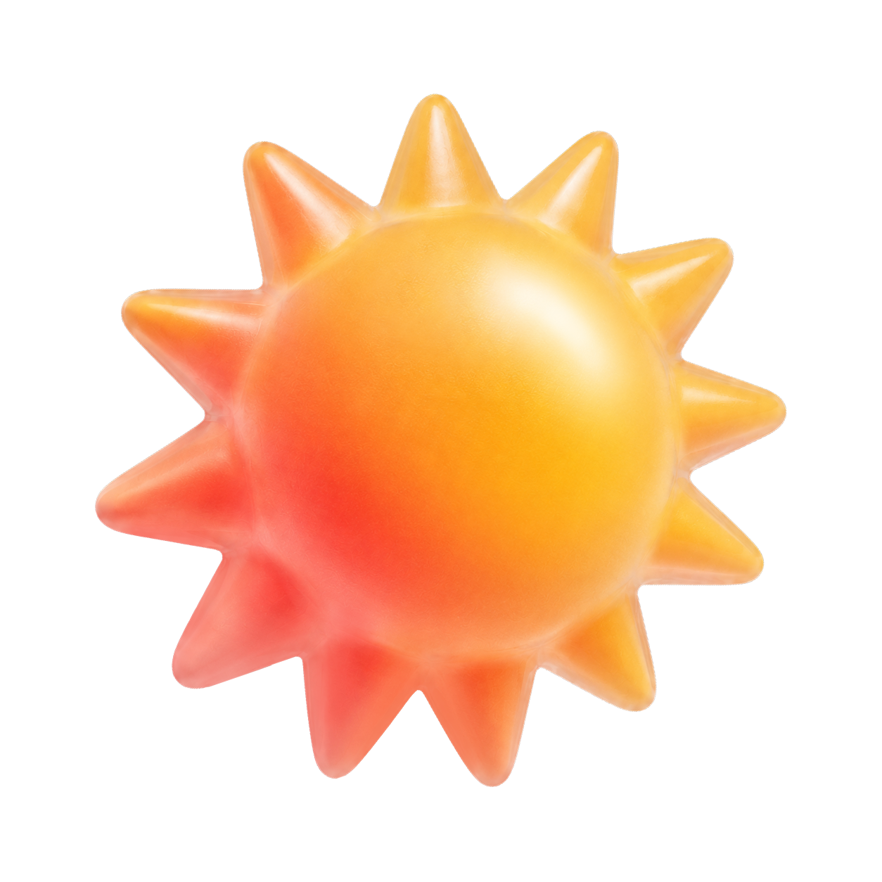
Skeuomorphism is a design trend that looks to imitate everyday objects in the physical world. This usually involves taking the visual characteristics of something we may see in real life and making them 3D with texture, color, and patterns so it appears as if they were crafted from those materials.
By using this kind of design approach, skeuomorphic designs often look quite realistic and make users feel more connected to the product they're interacting with.
The role of skeuomorphism in user experience
Skeuomorphism plays a key role in by creating a familiar and comfortable environment for users and helping them easily understand the purpose of different items on the screen. For example, buttons can be designed to look like physical switches with shadows to resemble depth, while text fields may be designed to appear as if they are written down on paper.
These designs help users identify what they should do more quickly, leading to fewer mistakes and better overall performance.
Examples of skeuomorphic design
Skeuomorphic design is everywhere. You can find numerous examples of skeuomorphic design throughout the tech world. This includes:
- Calculator apps: Calculator apps often have a 3D-like look that perfectly mimics the physical calculator you may have at home. This helps users feel comfortable and quickly understand how to use the app.
- Toggle switches: Toggles can often be a point of friction for usability. The shadows and realism of the toggles help users identify them as something they’ve already had contact with, and they can easily “switch” like they would normally.
- iBooks: Wood textures are used in the background of iBooks, creating an inviting environment for readers and reducing any feelings of intimidation associated with reading digital material.
Advantages and disadvantages of skeuomorphism
Skeuomorphic design can be a great way to create recognizable and easy-to-understand interfaces for your users. However, it has some advantages and disadvantages:
Advantages
- Familiarity: The designs often use visual cues that users are familiar with, making it easier for them to understand and use the interface. For example, the trash can icon on a computer desktop mimics a physical trash can and is immediately recognizable to most users.
- Intuitiveness: Skeuomorphic designs can be more intuitive, especially for people who aren’t tech-savvy or new to a particular device or software. The use of visual metaphors and analogies can help users understand how to interact with the interface.
- Emotional appeal: The designs can evoke positive emotions in users by tapping into their memories and experiences.
Disadvantages
- Clutter: Skeuomorphic designs can be cluttered and visually busy, especially when designers try to mimic every detail of a physical object. This can make the interface harder to navigate, especially on smaller screens.
- Limitations: Skeuomorphic designs can be limiting in terms of functionality and innovation. Designers may feel constrained by the need to mimic physical objects and may miss opportunities to create new and innovative designs that better meet users' needs.
- Inconsistency: Skeuomorphic designs can be inconsistent across different devices and platforms, confusing users and making it harder for them to switch between devices.
Evolution of skeuomorphism
Skeuomorphism has come a long way since its early days. The initial wave of skeuomorphic design was all about creating completely realistic interface elements that mimicked their physical counterparts. However, this approach has seen some refinements over the years to create more modern and sophisticated designs that still maintain the essence of what makes skeuomorphism unique.
For example, employing subtle gradients and shadows to give an idea of depth or incorporating small details like textures for added visual interest are now becoming commonplace for skeuomorphic designs.
Additionally, are beginning to focus on making UI elements look less "toy-like" by introducing natural colors and muted tones—which help make these designs look more polished and professional.
Skeuomorphism in digital design
Skeuomorphism has been around since the early days of digital design, and its popularity has surged in recent years. This is due to designers looking for ways to make interfaces more intuitive and user-friendly. By creating realistic designs that look like physical objects, users can easily identify what they should do next—leading to better performance overall.
Skeuomorphism in graphical and visual design
Skeuomorphism can also be found in graphical and . For example, logos often use skeuomorphic elements to draw attention and create a more interesting image. Additionally, motion graphics designers incorporate tactile textures and behaviors into animations to give them a more lifelike feel.
The history of skeuomorphism in digital design
Skeuomorphism can be traced back to the early days of computers. The first examples of skeuomorphic design were seen in applications like Microsoft Word, which mimicked the look and feel of a typewriter.
As technology has advanced, designers have grown more creative with their designs—creating realistic 3D representations of physical objects that can be seen all over today's digital interfaces.
Skeuomorphism vs. neomorphism
Skeuomorphism and neomorphism are two terms often used interchangeably, but they have slightly different meanings.
Skeuomorphism refers to designs that imitate real-life objects, while neomorphism is a newer trend in which shadows and gradients are used to infer or create something new that’s never been seen before.
Neomorphic design is often seen as a modern version of skeuomorphic design. You can use it to create more sophisticated interfaces that feel realistic without being too over the top.
The fall of skeuomorphism and the rise of flat design
Skeuomorphism was a popular design trend for many years, and it has its advantages, but as technology advanced, it began to fall out of favor and appear outdated. This is because has become increasingly popular, and many users find this type of interface easier to use.
Flat designs are often more modern-looking and allow for a greater amount of flexibility when it comes to creating an interface.
Additionally, these designs are usually quicker and simpler to create than skeuomorphic ones—making them a more attractive option for developers looking to save time and money. As such, the rise of flat design has recently seen a decline in skeuomorphism's popularity.
Is skeuomorphism not used anymore?
While flat design has become increasingly popular in recent years, skeuomorphic design is still used in many applications.
Games often incorporate realistic textures and behaviors into the to create an immersive experience for players. Additionally, many companies have found ways to integrate modern flat design with subtle skeuomorphic elements—creating interfaces that feel familiar but still look fresh and modern.
Final word
Skeuomorphism is a powerful and useful design concept that helps create user interfaces that are familiar, easy to understand, and engaging.
When integrating an unfamiliar feature or tool into an existing interface, it may seem more intuitive to the users, allowing them to understand it better. Whether it's a simple application on your phone or complex software for enterprise needs, skeuomorphic design can make your users feel like an expert in no time.
Should you be using a customer intelligence platform?
Do you want to discover previous user research faster?
Do you share your user research findings with others?
Do you analyze user research data?