What is flat design?
Flat design is a UI design that uses simple features and a bright palette. It’s a fast-loading, responsive design with few textures and shapes, and it reduces "visual noise" so that there’s a great . Flat design became popular with Windows 8 and today is used in designs like emoticons.
There are a few drawbacks, such as the inability to have buttons distinct from other elements because of a lack of drop shadows. Because of this, flat design 2.0 takes the flat design simple visual and adds a bit of color variance or shadow so that there’s added dimension. Google's Material Design incorporates flat design 2.0 for a more intuitive effect.
The origins of flat design
Flat design got its origins around the 1920s but became popularized in the 1950s and 1960s. With its minimalist style, it was the key to many advertising plans. The resurgence of the design came in 2006 when Microsoft released the Zune media player, which came with a lower-case font menu. The Zune software for desktop was also in this style pattern.
This was further developed in 2010 when the Windows Phone 7 came out with the sans-serif font, large shapes, bright colors, and flat icons. This flat design would soon be termed "Metro" by Microsoft.
[Asset: 7sym5NCnXItOFoJ7OyT5Mz]
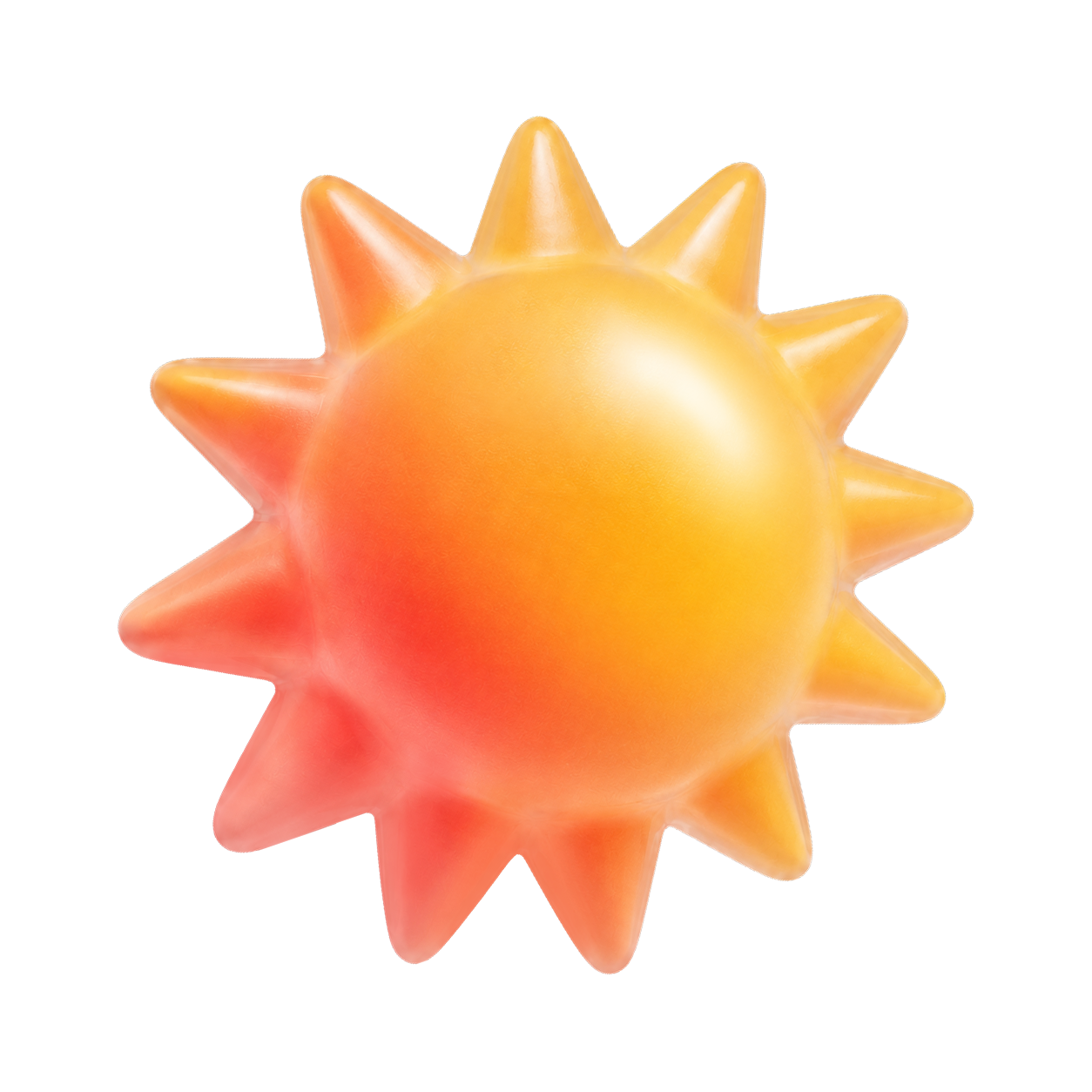
By Bkwparadox - Own work, CC BY-SA 3.0, https://commons.wikimedia.org/w/index.php?curid=4315076
What are the characteristics of flat design?
It’s categorized by simple styling, bright colors, and sans-serif font. Minimalist designs like this have been downplayed for being "boring" when they’re actually popular and remove the clutter from designs.
Flat design improves the user experience by offering fast load times and a clean, easily readable form. The simplicity of the design is paramount to its effectiveness and can help guide the eye on what to look for in advertising, marketing, and lead pages.
When should you use flat design?
Many different applications are perfect for flat design, including:
Manuals and guidebooks
Whether printed or online, pages that help someone follow instructions step-by-step are a great way to use flat design for maximum readability.
Infographics
The flat design works in grid format, so it’s a great application for infographics.
Mobile and website application icons
Where you need something that’s easy to read in a small space, the minimalist style of flat design is perfect.
Logos and branding
If you need to convey a business concept to those that aren’t familiar with your company, flat design logos and branding can help show a little about your organization in a simple form.
Mobile game interface
For the games that want simple distractions and don’t want to deal with adding overly complex fonts and colors that increase sensory stimulation, the use of flat design works well.
Advertising
Last but not least, the flat design is made for advertising where you want to drive home what your service or product is and how it benefits. From simple graphics, easy fonts, and bright attention-seeking colors, the flat design delivers without having to weed through clutter to get to the message.
When should you not use flat design?
There are some applications where using flat design is not a good choice. Some of these applications include:
Team mascots
These characters would lose their personality if they were 2D, un-textured, un-shaded icons. Creating their complexity gives them life.
Product packaging
Unless you’re creating "brandless" or "generic" items, product packaging should pop off the shelves with beautiful artwork and elaborate details to grab the customer.
Social and public service sites
With all the pluses of the flat design, one thing you can't say for it is that it has humanity and diversity. To create that, you need to step outside the flat design theme and create a website with soul and a human aspect.
Graphic tees and apparel
Clothing can have flat imaging, but the vast majority of apparel and graphic tee shirts should have something stylish and multilayered in the design of the graphics. Stylish designs typically equal higher sales.
Book covers
While self-help and business books are fine in the flat design concept, genres like horror and romance aren’t a good fit. These covers rely on realism and life-like imagery to bring that virtual world into the minds of the readers.
While it's the substance of a book that should count, readers are more apt to pick up titles where the book cover invokes a response in them. Most best-selling book covers have a huge A/B marketing team to help choose covers that give the most appealing and enticing visuals.
What is the advantage of flat design?
There are several advantages to using a flat design. It's currently one of the trendiest designs, as it’s seen everywhere in branding, packaging, marketing, and .
It also plays well with the responsive design needs of the mobile application. Simplicity and grid-based layouts make flat design great and allow you to rearrange it for all screen sizes and devices. With its quick load time, a flat design can be an impatient web surfer's dream.
Another plus to this design is the clean factor. The font and visuals are stunning and creative in their own right. With a good font coupled with bright color choices, they can pop off the advertisement and draw the eye to what you want readers to see.
The criticism of flat design
Some criticize this design scheme even at the height of its popularity. The flat design's lack of distinctiveness is one of the main cons of the theme. With the simplistic format and its constraints for use, you can make few choices with it.
Because of this, many companies will look similar to their counterparts because of the lack of customization and personalization. Visuals tend to be generic and easily interchanged with others in the flat design style.
Others say that minimalism can be overdone and become awash in a featureless format where everything blends together and nothing stands out. It’s not to be used with a complex visual or complicated message.
Then there’s flat design's compromised useability in that a clean and bright design loses the ability to have easily seen clickability and key actions can be hidden. Without shading and textures, something designers added in with flat design 2.0, buttons and arrows look like every other 2D icon on the page.
How to create flat design
Creating flat design means focusing on the simplicity of the project. Easy-to-read fonts with sans serif typography, strong colors, and clean UI elements are the cornerstones of flat design. By keeping to those three elements, the flat design creation should have functionality and a consistent visual.
Flat design examples
Some of the easiest examples of flat designs are emoticons. Those smiley faces and thumbs-up icons are simple designs that create a streamlined, fast-loading system that’s easy to understand and distinguish. These are one of the best examples of the flat design format.
Usability problems with flat design
If you overuse flat design on a project, some usability issues can arise. Some of these problems come from there being no depth to the designs, and therefore there’s no sign of interactivity. The user can’t easily see that something is a clickable element in the design without the textures and gradients.
Should you be using a customer intelligence platform?
Do you want to discover previous user research faster?
Do you share your user research findings with others?
Do you analyze user research data?