How to synthesize data like a pro through affinity diagramming

Synthesis is the mysterious and untouchable part of user research. The synthesis process often gets glazed over in presentations or elicits moans and eye rolls from researchers, regardless of seniority. It’s a touchy subject.
When I first learned about user research, I was baffled at how researchers went from interviews to these beautiful, concise statements called insights. The hours I spent speaking to participants amounted to piles of data. I couldn't understand how to make this raw data into insights or find those notorious patterns and trends I kept hearing about. I walked around with a question mark above my head, trying to present raw data in a way that wasn't overwhelming.
After a few weeks, someone told me to cluster important information from the interviews, resulting in clear and actionable insights. I had so many questions. How did I know what was important? What is clustering? What is an actionable insight (that one still gets me)? And how do I not overwhelm myself with reviewing all this information?
Eventually, after much trial and error, and before Google helped surface user research-related content, I found out about affinity diagramming. With those two words, everything in my synthesis process started to change and improve.
What is affinity diagramming?
An affinity diagram is a visual brainstorming tool that allows teams to organize large amounts of data into groups or themes based on their relationships. They are perfect for making sense of the mess of qualitative data I mentioned above because they are all about bundling and grouping similar information.
Affinity diagrams give you a way to filter through all your qualitative data and see what patterns and trends emerge. During this exercise, you will look through your notes and organize related information into clear groups and themes.

One remarkable facet of affinity diagrams is that you can use them alone or with a group of stakeholders. I have used affinity diagrams by myself to organize my thoughts after a research project. I have also pulled stakeholders into affinity diagramming to synthesis research in a group.
Since the concept of affinity diagrams is abstract, I learned how to do affinity diagrams through practice and experimenting. So get your qualitative data and let's go through an example!
How to create an affinity diagram
Before we dive into creating an affinity diagram, there are a few concepts to address and steps to prepare.
When I started using affinity diagrams, I struggled to figure out what "important" information meant. How was I supposed to start sifting through all this data and seemingly know when something was important? That is where tags come into play.
What are tags?
Tags can have several different names, such as codes or themes. Essentially, they are ways to code information into a single word. For example, let's say we are researching how people plan travel. When you look through your notes, you might find quite a few people said a similar thing:
"When the travel gets complex, I use a travel agent, even if they cost money."
"If I have multiple stops or dealing with multiple airlines and it is complicated, I use a travel agent."
"I will only use a travel agent when I am booking lots of different trips within the same holiday, and there are moving parts."
"I use a travel agent when traveling with my family on a longer holiday because doing it myself is just too complicated."
If you see this information come up repeatedly in your notes, you can start to code this with the words "travel agent," as these statements are all related to hiring a travel agent for trip planning.
Alternatively, there are common tags you could use if you don't want to create your own. When I was starting in user research, I used these tags (and still do!):
Goal–what the person is trying to accomplish as an outcome
Motivation–why the person is trying to achieve that goal
Core value–how that motivation or accomplishment makes them feel
Need–something a person needs to fulfill a goal
Pain point–a barrier or difficulty towards accomplishing a goal
Task–something a person does to achieve a goal
Tools–a tool a person uses to try to accomplish a goal
Positive emotion–something that makes a person feel positively
If you see similar information coming up more than four times, it becomes important. For example, if we heard four or more participants talking about travel agents, that would become a trend and pattern in the research worth looking into. Generally, I like to focus on four to five tags per affinity diagram.
The process (with an example!)
Once you decide if you will create your tags or use the ones above in the list, the process of affinity diagramming can begin. Here is my step-by-step guide on how to create an affinity diagram through an example. Keep in mind that all of the data shown here is fake data for example purposes!
Let's go back to the above example of working at a travel company and exploring how people plan travel.
I have decided to go with the predetermined tags from above, and I will focus on pain points, motivations, goals, needs, and tasks as the main tags.
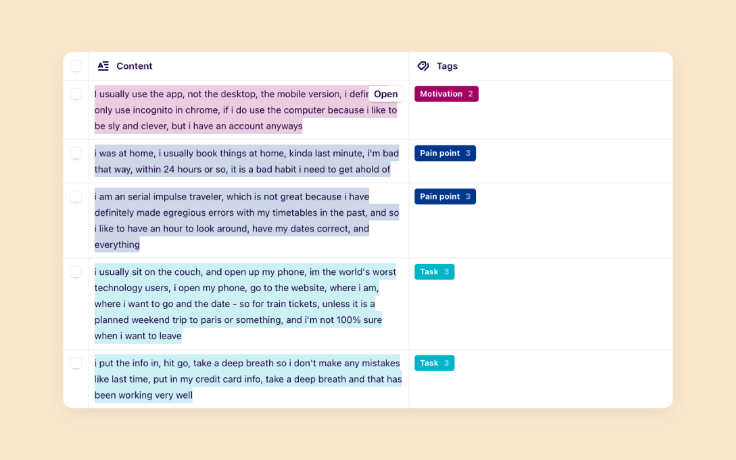
I gather the notes I've taken for each participant and review them. I code the qualitative data into these tags.
![Using Dovetail, you can tag your notes around different themes, allowing you to uncover different patterns in your data.]() Using Dovetail, you can tag your notes around different themes, allowing you to uncover different patterns in your data.
Using Dovetail, you can tag your notes around different themes, allowing you to uncover different patterns in your data.Once each participant is reviewed, I get out my post-its (and the fun begins). Starting with pain points, I go through each participant and write one pain point per post-it. I include the participant number on the post-it. I do this for each participant and each tag. For example, I go through the data for pain points, and my post-its might read:
P1—Never know when to book tickets because the prices keep going up and down
P3—The fluctuation in prices is frustrating because it makes it hard to know when to book
P5—Trying to figure out when to book tickets and the right timing for the best price
P6—Seeing the prices go down after I purchased
P2—I hate trying to make changes to my flights because of the fees
P3—Getting a refund on a trip is impossible because there is always a loophole, and I have to pay
P5—Last minute changes or refunds to a trip are the worst - I can never get a refund, even if I feel like I have a good reason
P7—Customer support with changing trip details or canceling a trip is so stressful - they never let you do it without a fee
Once I create all the post-its for the tags (pain points, goals, motivations), I put each of the post-its under their relevant group
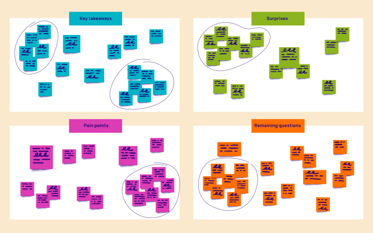
Once I have put all the post-its into their groups, I create clusters of similar ideas. If you look at the example pain points I listed above, you can see two distinct groups emerging, a pain point about fluctuating prices and a pain point about making changes to flights. I put all of these similar post-its together and create a group.
I do this for each group (pain points, goals, motivations, needs) until I have clustered everything
![]()
I review the clusters, and those with four or more post-its become the most vital information to focus on from the qualitative data.
Once you have completed an affinity diagram, you can see which trends and, thus, the most important insights are that came out of your study. This process will ensure you report on the crucial information and that your teams know what to prioritize from the research. Keep practicing and, soon, affinity diagramming will become second nature!
Written by Nikki Anderson, User Research Lead & Instructor. Nikki is a User Research Lead and Instructor with over eight years of experience. She has worked in all different sizes of companies, ranging from a tiny start-up called ALICE to large corporation Zalando, and also as a freelancer. During this time, she has led a diverse range of end-to-end research projects across the world, specializing in generative user research. Nikki also owns her own company, User Research Academy, a community and education platform designed to help people get into the field of user research, or learn more about how user research impacts their current role. User Research Academy hosts online classes, content, as well as personalized mentorship opportunities with Nikki. She is extremely passionate about teaching and supporting others throughout their journey in user research. To spread the word of research and help others transition and grow in the field, she writes as a writer at dscout and Dovetail. Outside of the world of user research, you can find Nikki (happily) surrounded by animals, including her dog and two cats, reading on her Kindle, playing old-school video games like Pokemon and World of Warcraft, and writing fiction novels.


