What is Net Promoter Score (NPS)? – a guide for UX practitioners
The Net Promoter Score (NPS) is a loyalty metric that aims to quantify the likelihood of someone recommending a company, product, or service, to a friend or colleague.
The metric was introduced by Fred Reichheld (with development from Bain & Company and Satmetrix) in the Harvard Business Review article “The One Number You Need to Grow”.
Since its introduction in 2003, the Net Promoter Score has become industry-standard for organizations wanting to become more customer-centric and improve customer experience. NPS has become so prevalent that it’s now reported to investors and boards alongside financial information.
How is NPS collected?
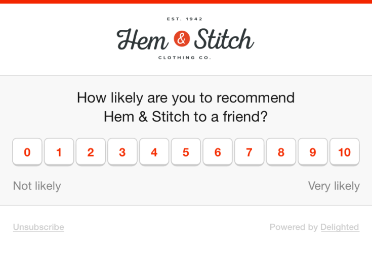
NPS is collected by surveying your customers with a simple question that is answered on an 11-point scale:
On a scale of 0 (not likely) to 10 (very likely), how likely are you to recommend us to a friend or colleague?
There are a number of software tools available to help you collect and measure NPS. Some of the more popular tools include Delighted, Wootric, AskNicely, and Promoter.io.

How is NPS calculated?
Based on the 11-point rating that a customer responds with, they are segmented into three categories:
Promoters: those who respond with 9 or 10.
Passives: those who respond with 7 or 8.
Detractors those who respond between 0 and 6.
The Net Promoter Score is calculated by subtracting the % of detractors from the % of promoters. Your NPS is represented as an integer anywhere between -100 to 100. The calculated score should never be represented as a percentage. Passives are always ignored in the calculation of NPS.
As you might have already gathered from these category names, promoters are loyal and passionate customers who refer you to others and bring you new business. Passives are indifferent – they could be happy enough, or might easily switch to a competitor. Lastly, detractors are unhappy customers who are at risk of switching to a competitor, and might dissuade new potential customers.
Is NPS useful and reliable?
The usefulness of NPS largely depends on how consistently and reliably it is measured. There are many variables and selection biases that could affect a customer’s response and your ability to reliably measure, for example:
delivery method – surveying customers while they’re using your product (eg. in-app) vs. outside of your product or service (eg. email or SMS).
relational or transactional delivery – surveying customers randomly vs. after they make a purchase, interact with support, or complete a usability test.
stage in the customer lifecycle – surveying customers who are relatively new vs. old customers.
industry or segment – surveying customers from certain industries or segments.
cadence of survey – surveying customers inconsistently, too frequently, or too rarely.
As the Net Promoter system makes no recommendation on these factors – and the implementation of NPS can vary from organization to organization – any comparison to competitors or industry benchmarks (despite their proliferance online) can be unproductive and should be taken with a grain of salt. NPS has even been co-opted to measure employee engagement and how likely employees are to recommend a company as a place to work.
With all that said, NPS can be a valuable metric to track customer loyalty and satisfaction trends over time if you can reliably and consistently deploy your survey. Over a long enough time period, NPS will serve as an important signal if customer loyalty is getting better or worse within your organization.
How should researchers and UX practitioners think about using NPS?
Some in the UX community, most notably Jared Spool and Gerry McGovern, have been critical of NPS and its methodology. However, the reality is that NPS has become the favored metric of customer-centric organizations and isn’t going away anytime soon. If measured consistently and reliably, it can be a useful metric for driving informed and positive changes for customers within an organization.
As Jared Spool calls out, embedding NPS into qualitative research studies – like in a usability test questionnaire – may be counterproductive. For example, participants are often confused if they’re being asked to score based on their overall perception of an organization, or based on their experience testing the prototype in a usability test. Similarly, incentivized research participants could be less likely to honestly answer for fear of not being compensated. Researchers and designers should be aware that deploying NPS in this way is unlikely to yield accurate or useful results – there are better instruments out there for measuring the performance of usability tests.
UX practitioners should instead look to NPS as a useful driver for influencing stakeholders and executives to prioritize investments in improving the customer experience. Leveraging qualitative research to further understand the reasons behind an organization’s score can drive large scale change.
How to get to the “why” behind the score?
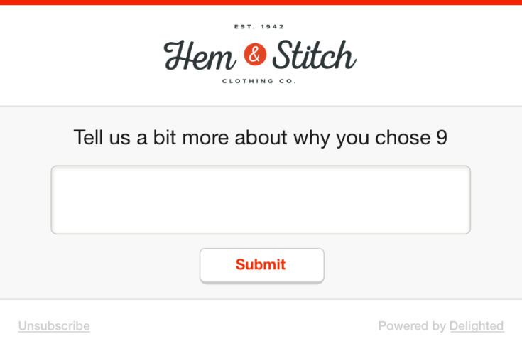
Net Promoter Score by itself is crude metric – you can’t extract much meaning or rationale from a single digit (as the critics point out). All smart implementations of NPS will ask a follow up question. After a customer selects their rating from 0-10, they will be displayed a qualitative follow up question that asks why a customer gave that score.

This is where the real gold of NPS is, and where researchers should focus their attention. Even critics of NPS concede that the real value is in the follow up question.
Once you’ve started to collect follow up comments from NPS responses, it’s important to perform a thematic analysis to identify the patterns and their frequency. Depending on the volume of responses, analyzing these responses can be a time-consuming and cumbersome process.
Most of the popular NPS survey tools can be integrated with Dovetail to help speed up your analysis and find themes quickly.

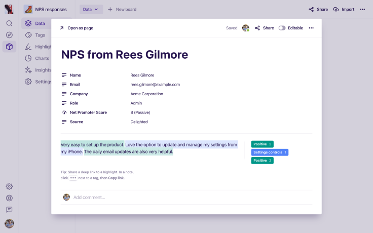
With Dovetail, you can quickly tag your NPS responses with themes and start to form groups. Other data you’ve collected in your NPS survey can also be stored within each NPS response. The respondent’s score, name, email, or any other information you collect, can then be used to filter and segment your responses in Dovetail.

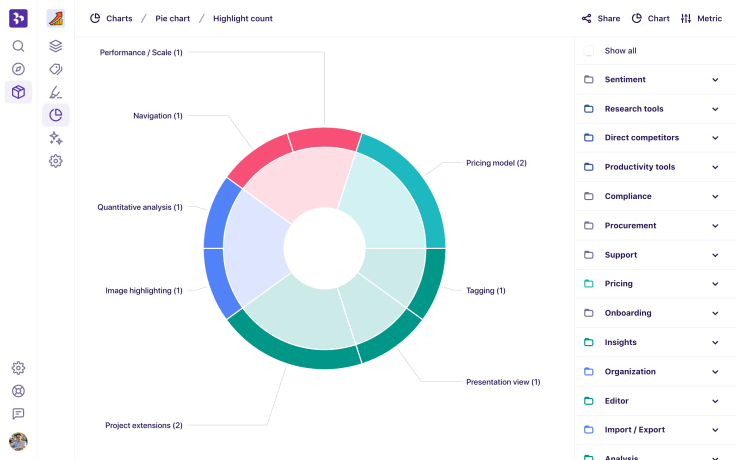
Once you’ve analyzed your NPS responses, use charts in Dovetail to quantify how frequently problems or product areas are mentioned by your customers. Charts are great for getting a quick view of the themes, features, and areas that are responsible for affecting your NPS score.
Read more in our guide How to analyze NPS responses with Dovetail.


