Our new charts help you measure your tagging over time

As you deliver new features and improvements you need to know whether they’re having the desired impact. You might be familiar with hypotheses or success metrics describing what might happen when a new feature is released, however actually understanding the impact and reception of a change once it’s out in the wild can be tough.
When we ship this feature, we expect requests for this feature to decrease.
The user feedback we receive will be more about tuning the MVP of what we’ve shipped.
We expect overall user satisfaction to increase once we ship this new feature.
How do you actually answer these questions? Often teams will look at engagement metrics to see whether their new feature is being used and how much it’s used relative to other existing features. But this only tells you part of the story. What do your users actually think about the new feature? Have you delivered something that delivers value, or is there still more work to do?
This week we’re launching our brand new charts which helps designers, product managers, and researchers combine the power of Dovetail’s qualitative tagging with a quantitative visualization over time.
In this blog post we’ll give an overview of what you can do using our own customer feedback project as an example.
Roll up tags into groups for comparison
In Dovetail, tags can be grouped together to help with organization. For instance, you might have a group containing all the tags relating to usability problems. Or you might group your tags by type of feature request.
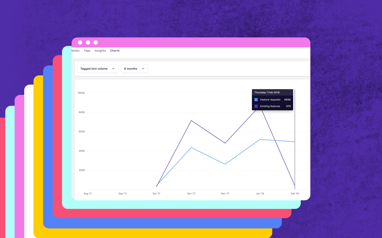
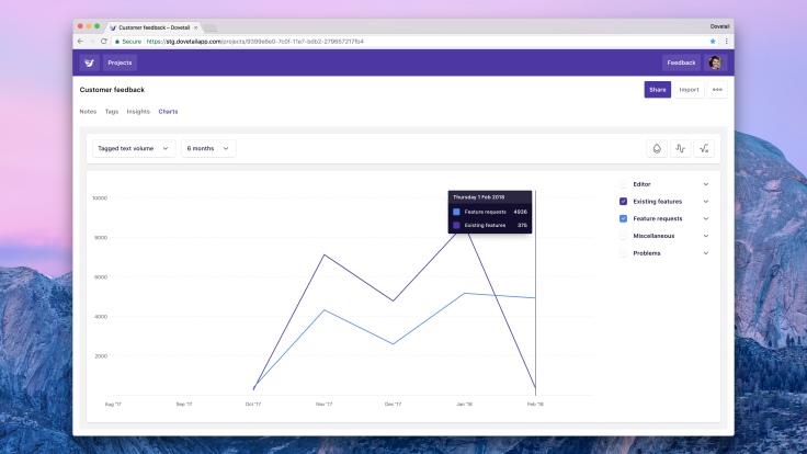
In our case, we’ve put feedback containing new feature requests in one group and feedback about existing features in another. In our new chart, we can select these two groups and see how they compare:

We can see feedback on existing features has been decreasing, whereas feedback about new feature requests has been staying steady. This makes sense because we’ve been shipping more improvements to our core feature set recently, and resolving a few frustrating issues.
Let’s dive into the feature requests and find out what’s popular.
Compare relative frequency of tags
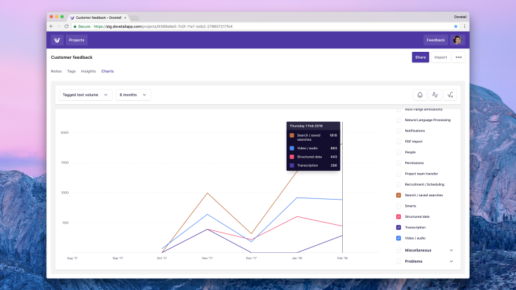
We can open a group, for example feature requests, and see how each tag compares to one another. This gives us more information about what features people are after so we can anticipate trends and prioritize work accordingly.

Here we’re comparing the volume of feedback for a few different features we’re considering building. ‘Search / saved searches’ is by far the most popular and in fact that’s what we’re working on shortly.
Chart metrics
Three chart metrics give you a slightly different perspective on the data.
Annotations by tag. This shows the total count of annotations created on notes. For example, if you have 10 notes and across those notes you tag 14 annotations, this would show 14.
Annotations by note. This is very similar to annotations by tag however it will only count an annotation at most once per note. Using the example above, this chart would show 10 annotations for performance. This is quite useful to adjust for ‘vocal minorities’ who might mention the same thing multiple times in a single piece of feedback.
Tagged text volume. This shows the total character count per annotation. This chart is very useful to help you get an understanding of importance. Generally if people take more time to describe their problem or feature request, they think it’s quite important.
Data visualization options
Along with the three chart metrics above, there are also several toggles to change how the data is presented. These can be found near the top right of the chart, above the legend / filters.

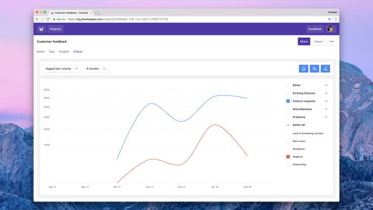
Use color from tag / group. By default, chart colors come from a pre-determined array. This setting overrides that behavior and colors the lines according to the actual color of your tag or group.
Use smoothed interpolation. This setting switches between ‘jagged’ lines and ‘curvy’ lines. This one’s great for taking nice screenshots!
Use square root Y axis. This setting switches between a linear axis and a square root axis. This improves readability with low volumes of data.
Charts are part of a foundation we’re building to help our customers work with higher volumes of user feedback. It’s available now to all Dovetail users, and you’ll find it in project navigation, next to Insights.
We’re really looking forward to hearing your thoughts! Click the Feedback button in-product or jump in our new Slack workspace to get in touch.


