The team and vision behind Dovetail’s brand evolution
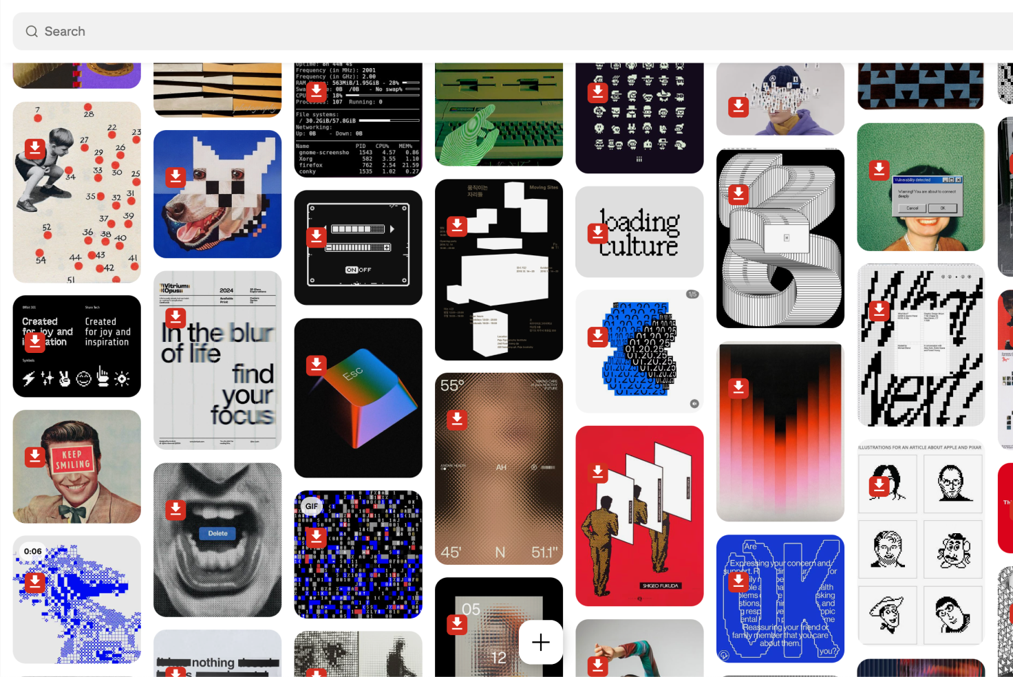
Every element of Dovetail’s visual identity is meticulously handled and brought to life by our in-house creative studio. Recently, the team took on a massive project: wiping the slate clean to rebuild our brand identity from the ground up.
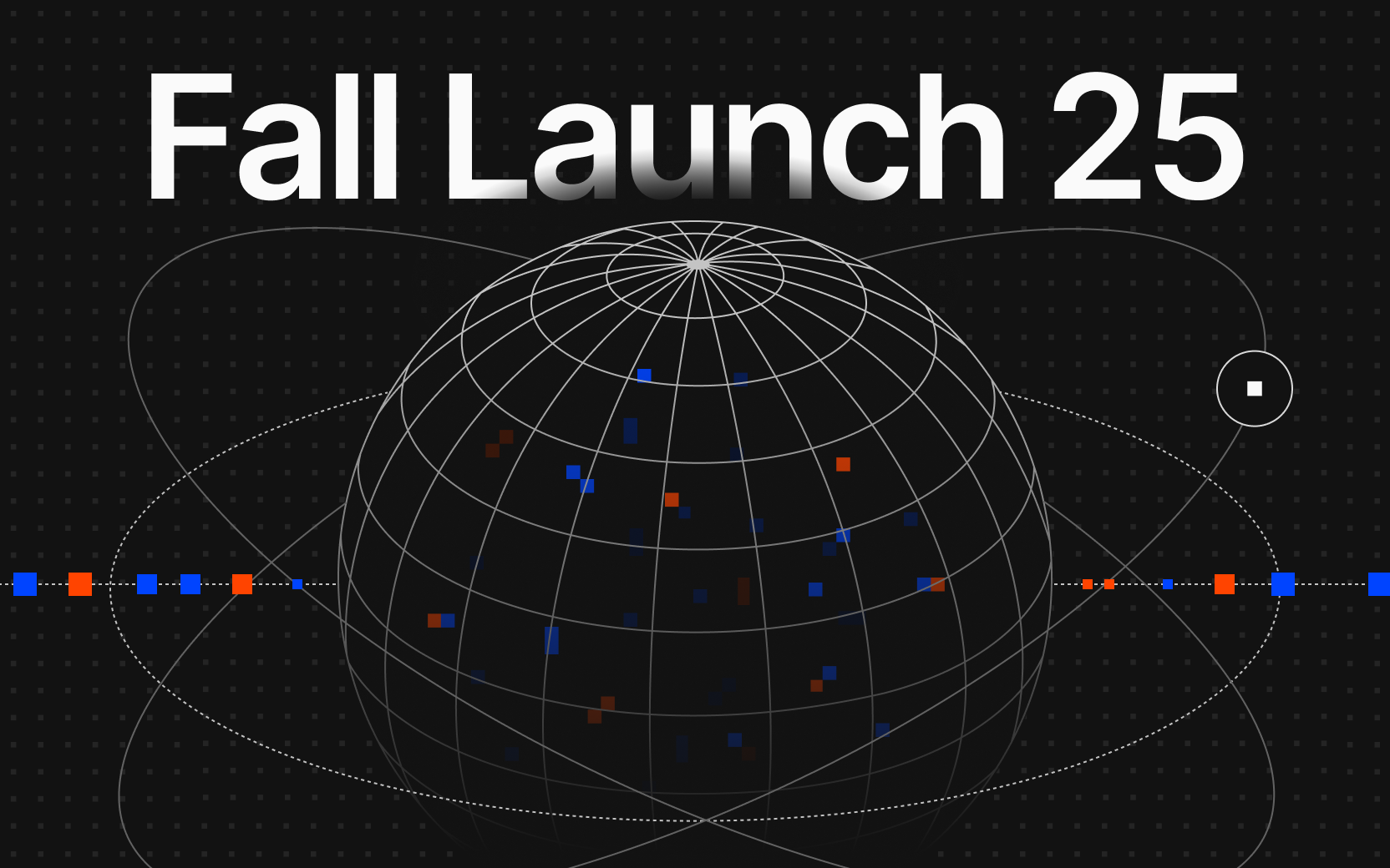
October 2025 was a big month for Dovetail. We unveiled a major product transformation with the launch of our customer intelligence platform. With this launch came a huge leap forward for our product. What was once a tool to help teams transform feedback into insights that inform product decisions is now an always-on intelligence platform that’s built to enable teams to go from feedback to code at speed. Our creative studio was tasked with reimagining our brand to articulate this new reality for our customers.
Meet the team behind our new brand identity, our in-house creative studio, and the backbone of Dovetail’s brand evolution: Tia (Creative Director), Martin (Motion Designer), Tristan (Web Designer) and Sherline and Emi (Brand and Visual Designers).
{{video:/media/01_Building_blocks_logo.mp4}}
Tia - Creative Director
Why was now the right time to rebrand?
Because the world moved—and we moved with it. The market had shifted, AI had arrived in full force, and the technology finally caught up with the ideas we’d been sitting on. For a long time, much of what we envisioned for the product wasn’t possible—too manual, too early. But now, the tools are here, and we can bring that vision to life.
This rebrand is about recognizing the pace of change. We’re looking ahead to where people are going, not just where they are today. What challenges will they face in a year or two? How do we show up ready for that? The goal is to give people confidence that we’re the right partner to help them navigate what’s next.
What’s changed?
Everything—on purpose.
Our old brand worked for who we were, but we’ve grown up. The product’s evolved, our thinking’s sharper, and our customers expect more. This rebrand reflects that maturity and momentum. We’re constantly thinking about how we solve problems, what’s needed to get us there, and what new use cases might emerge as our customers’ needs evolve. All of this needs to be taken into account.
The new identity is built to reflect that growth. It’s about projecting confidence, clarity, and stability in a fast-changing world. By rethinking everything from our visuals to our language—we’re saying: we understand the chaos, and we’re here to help make sense of it.
![]()
{{video:/media/05_Brand_building_blocks_Diagrams_736x492.mp4}}
Can you describe the new brand identity in a few words?
The hope was for it to feel intelligent, adaptive, and precise. We want to treat people as though they are able and informed, recognizing that they know what they need best, and we want our communications to reflect that.
Our brand is not a single moment in time. We’re a customer intelligence platform, and intelligence is always learning and changing depending on the input it receives. So that’s how I think about it; as something that is ever dynamic and evolving. It’s learning, shifting, growing. It’s alive—because intelligence doesn’t sit still.
What guides your creative direction?
It starts from inside the company—from the product, the people, and the shared vision. But it also requires constantly looking outward, understanding the world, and translating that into something meaningful. It’s part intuition, part observation.
Keeping our creative team in-house is key. It means we’re deeply connected to what’s being built and how it’s evolving. Inspiration comes from proximity—from everyday conversations, small insights, and shared challenges. You can’t design in a vacuum. The magic happens when you’re close to the product and the people shaping it.
That closeness allows us to create a brand from the inside out—not a mere observation, but an honest reflection of who we are and where we’re headed.
Emi - Brand and Visual Designer
How do you think the new color/typography/graphics change the way people experience Dovetail?
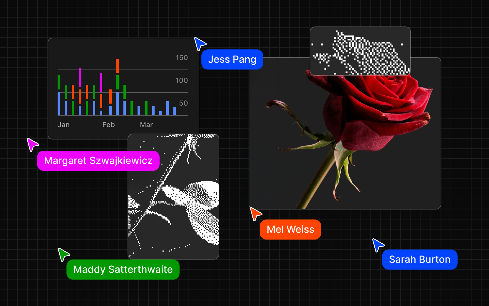
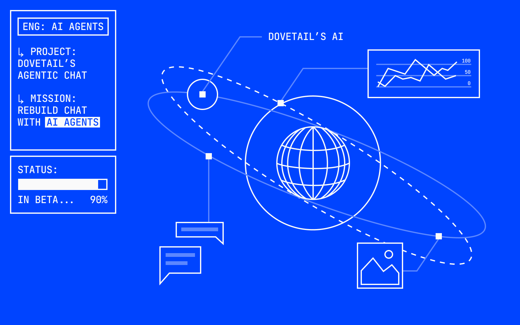
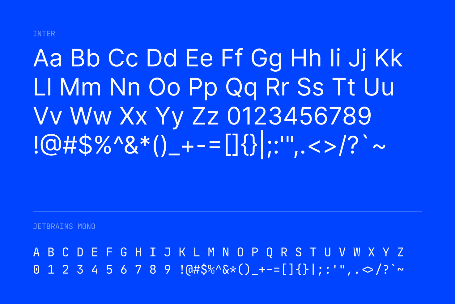
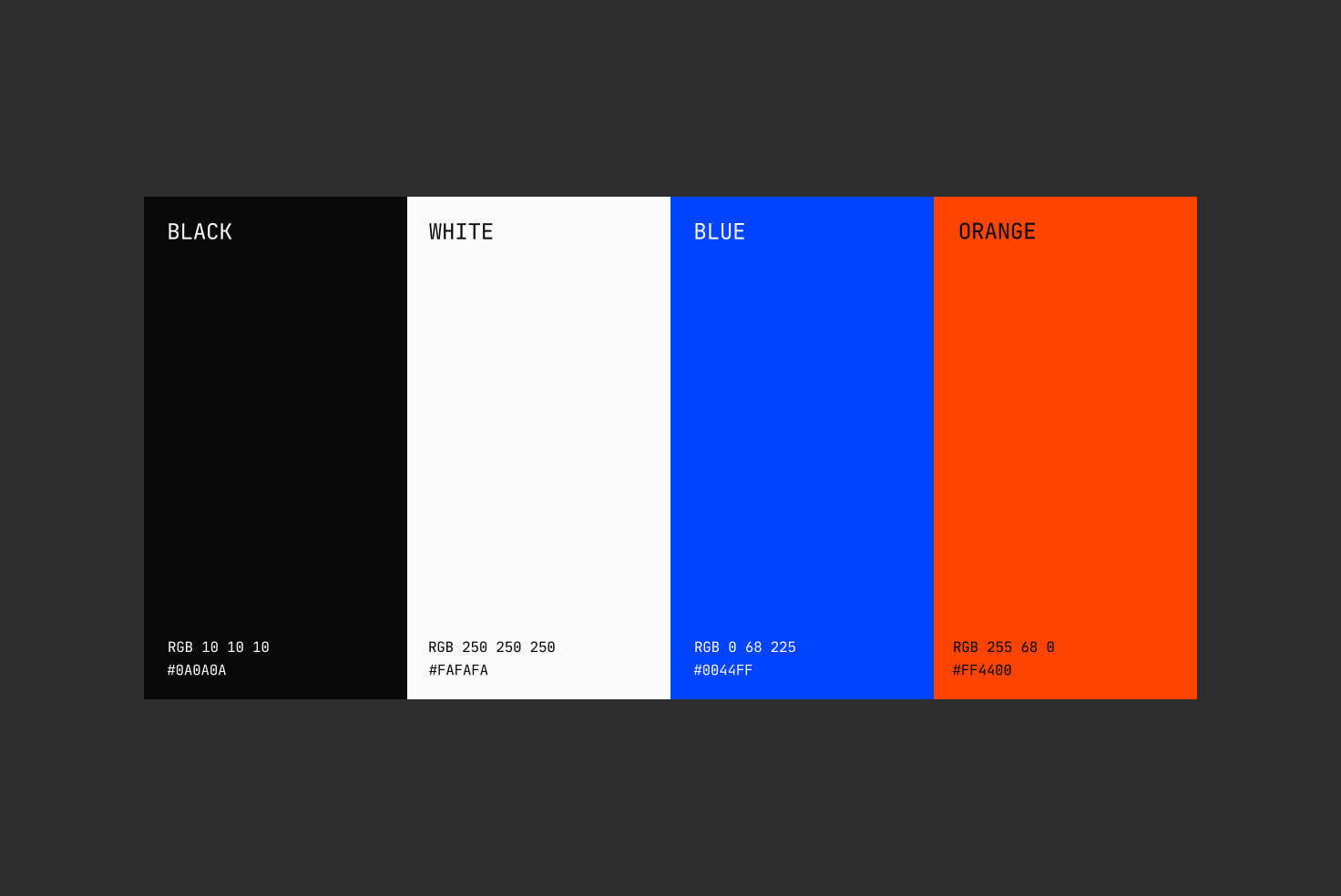
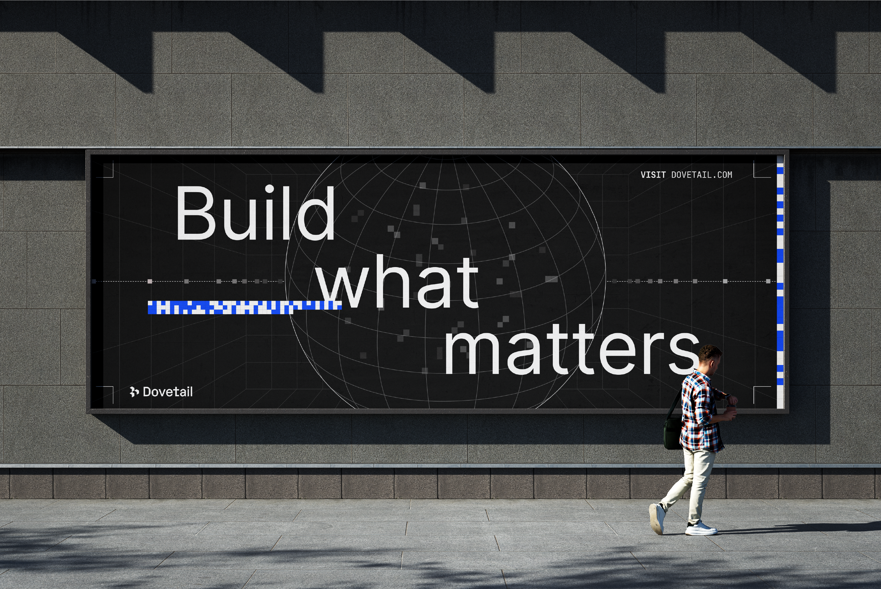
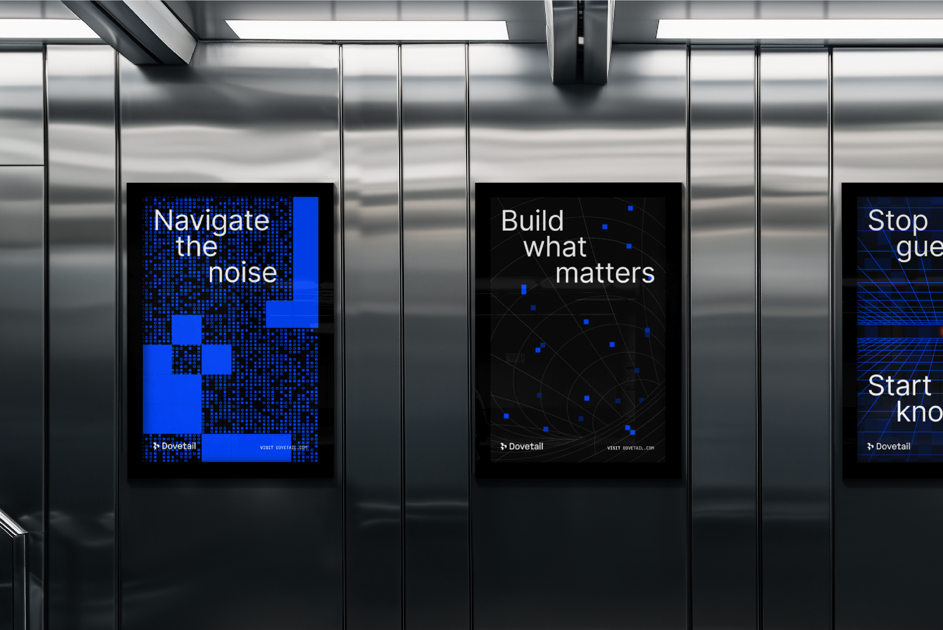
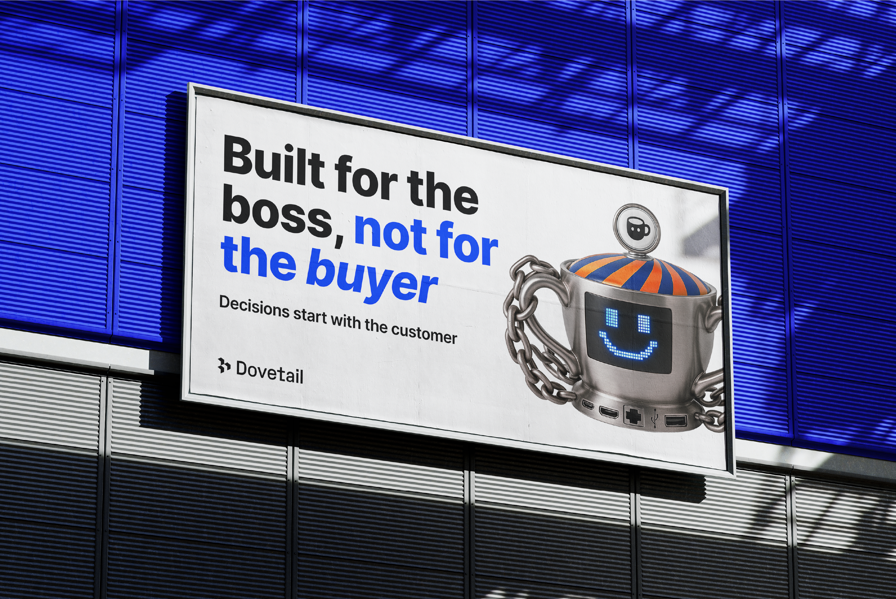
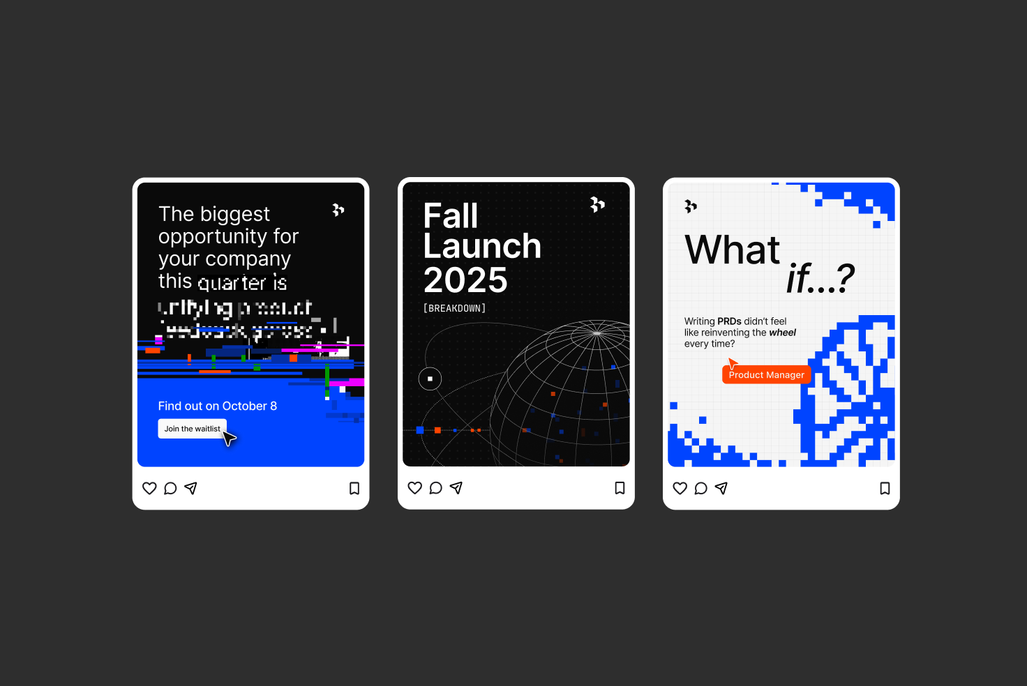
The new identity is grounded in the company’s engineering-driven direction. We’ve used a limited yet bold color palette and technical diagrams instead of our previous hand-drawn illustration style. We are communicating the depth and seriousness of our technology, moving beyond simplicity to showcase the powerful platform we are today.
The dark-mode style, simple typography, and technical visualizations present a confident and enterprise-grade platform that is ready to help customers face their significant challenges. The visual language is clear, hard-hitting, intentional, and designed to inspire confidence that our platform meets the needs of our customers.
What did doing this work in-house make possible that wouldn’t have been with an external agency?
Working in-house on this rebrand meant we were able to work at a rapid pace. We didn’t follow the typical process of creating concepts, presenting rounds and waiting for stakeholder feedback. Instead, we were in a constant feedback loop which meant we could begin to use the brand very early in the development process with the intention that the brand could be shaped as we test it, live.
What I also thought was unique was the high level of trust and autonomy we were given as a creative team. Being an internal studio, we have a deep understanding of the product and an innate understanding of the company’s messaging and values. I think because of this, we were empowered to create and direct the brand’s visual identity.
This is the starting point for the new customer intelligence platform we’ve launched, and it will only continue to improve and evolve from here.
{{video:/media/05_Digital_Campaign_ads.mp4}}
Sherline - Brand and Visual Designer
What part of the process felt most challenging—and most rewarding?
The real challenge was knowing we weren’t just designing a look—we were building a system. One that needed to feel cohesive yet flexible enough to work across our entire digital presence: from our product and website to events and internal tools. We had to make tough calls, zoom out on the brand’s long-term role, and rethink how we work as a design team.
The most rewarding part? Watching it take on a life of its own. Seeing teammates, from sales to engineering, use the brand with confidence and creativity. It’s one thing to polish assets in Figma. It’s another to see your work spark connection, ownership, and pride across the company.
{{video:/media/03_Digital_Socials.mp4}}
What did this project teach you about our team or culture at Dovetail?
That we always show up with humility, care, and a shared sense of ownership. No ego, just talented people working together to build something meaningful and make each other better.
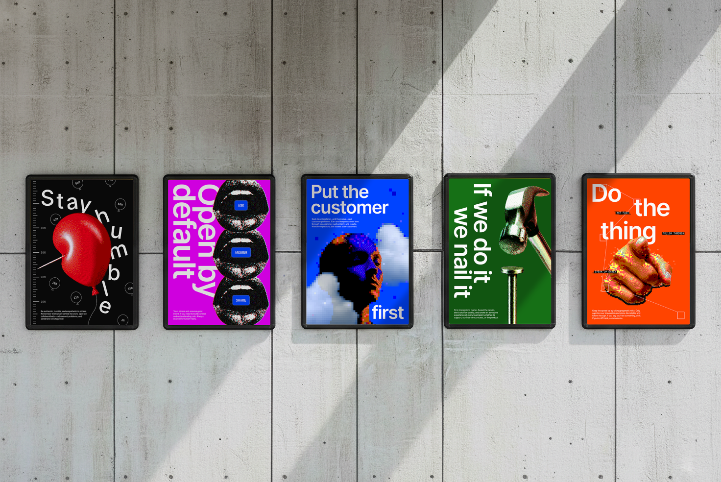
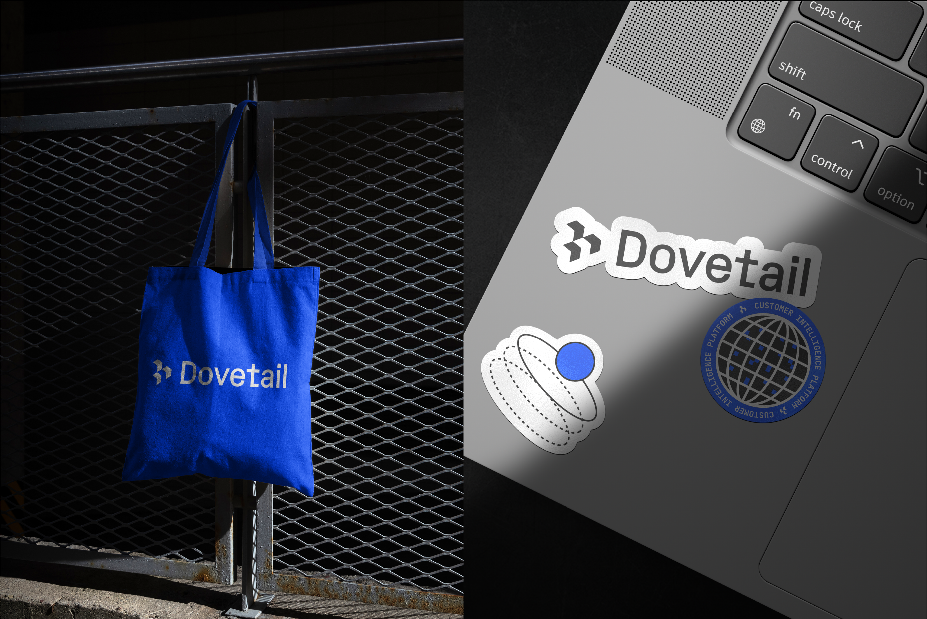
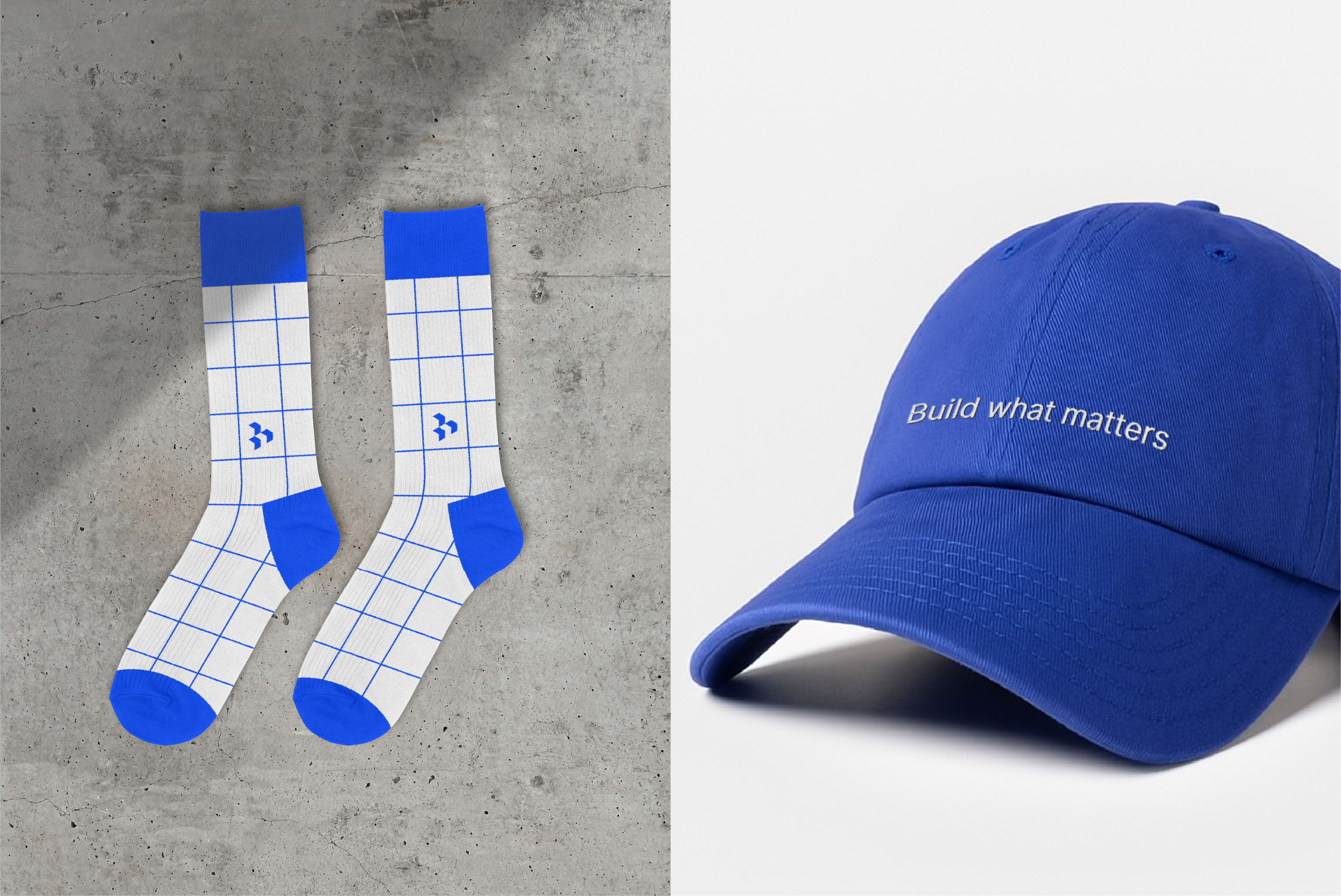
This project also showed how deeply strategic we can be. We weren’t just making things beautiful. We were designing for scale, clarity, and enablement. We thought critically about how others might use and build on the system, and how we could create tools—like templates, guidance, and shared libraries—that unlock creativity for everyone, not just designers.
{{video:/media/02_Digital_Templates.mp4}}
Most of all, it reaffirmed how cross-functional we are. Every piece of this rebrand was shaped through open collaboration across design, product, engineering, marketing, and beyond. We didn’t just build a brand, we built a foundation for others to grow with us.
Martin - Motion Designer
Why was creating a motion design system such a breakthrough for this project?
Previously, we lacked a defined motion identity. Motion can be a powerful addition to a brand, transforming it from static design communication to dynamic immersive experiences. We’ve defined a new system that allows us to cut through the noise of countless product videos in the market. We’ve established a framework that’s flexible and intentional in every frame, taking the audience on a storytelling journey, rather than just informing them of the destination, as you would expect from an always-on, evolving customer intelligence platform. As a result, we can now create motion design pieces more efficiently, without having to reinvent the wheel each time.
{{video:/media/047P_RebrandBlogVisuals_Dimension__1_.mp4}}
{{video:/media/04_Motion_Motion_guidelines__1_.mp4}}
{{video:/media/03_Motion_Type.mp4}}
How does motion design capture the essence of a customer intelligence platform?
Motion design has the power to take in complex information and transform that into an engaging story. The goals for the new motion identity were for it to feel that every pixel is alive and every movement feels intentional. By merging those two pillars, we were able to show how we interpret information in our platform, which is transforming raw data into meaningful understanding.
{{video:/media/01_Motion_Pixels.mp4}}
During the exploration phase, we looked into the idea of using pixel blocks as a tool to either use as a transitional device or a way to form an image. In order to do this, we leaned into using Cavalry to generate those pixels for us. This type of motion gives the brand an impression that it listens and reacts to everything it’s fed, much like our customer intelligence platform.
{{video:/media/02_Motion_GenerativePixels.mp4}}
Tristan - Web Designer
How did working in-house influence the way you approached design?
Coming from a freelance background, I often designed from a distance, with very little time to really understand the product I was working on. Being in-house changes that completely. You get to see how the product works, where it’s headed, and how people actually use it. As the in-house expert, you have greater influence over the final outcome. Your design decisions are trusted and supported by the team, which makes it easy to adjust quickly when priorities shift or the direction changes before a launch, without needing to continuously ask for feedback. Being this close to the product not only makes iteration faster, but also means decisions are based on knowledge, rather than trying to make sense of a brief.
{{video:/media/01_Digital_Website.mp4}}
How do you design for a brand that’s in motion—constantly learning and evolving?
You kind of have to let go of the idea that anything’s ever finished and get comfortable with the ongoing change. The brand’s always evolving with new ideas and new ways of visually representing the product, so the website design has to be able to move with it all the way up until launch (and long after). It’s never static, and that’s what makes it fun.
What I like about that is you’re never just maintaining something, you’re always improving it. You start to notice what works, what feels a bit dated, and what people are vibing with. Then you adjust. These adjustments get picked up by the brand team, which influences their work, so it’s less about defined rules and more about staying open to a continuous refinement cycle.
Head to our website and have a dig around, or watch our brand video to see our new identity in the flesh.
Related Articles