Introducing the new Dovetail experience—a simpler way to get around
We’re rolling out a new personalized home experience along with updates to sidebar, folder navigation, and search to help your team make sense of increasing data in your workspace.
We’ve been working towards ensuring that Dovetail integrates more deeply with multiple data sources where customer feedback is collected, helping you find insights faster in across a complex ecosystem of tools. Our goal is to make sure your Dovetail workspace scales effortlessly as feedback volume naturally grows, ensuring we can be your company’s always-on Customer Intelligence Platform.
Customer feedback is spread across customer conversations and user research, support tickets, sales calls, surveys, app reviews, and more. Traditionally in Dovetail admins have had to organize this data using folders, fields and tags, custom home content, and custom feeds. However as the volume of data increases, we know it becomes overwhelming for admins to organize it by hand.
New home
Previously Dovetail’s workspace home was static and manually updated by an admin. Our new home is dynamic, ensuring it displays personalized content that’s most relevant to an individual user.
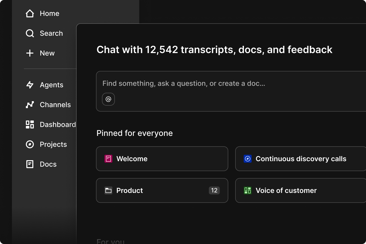
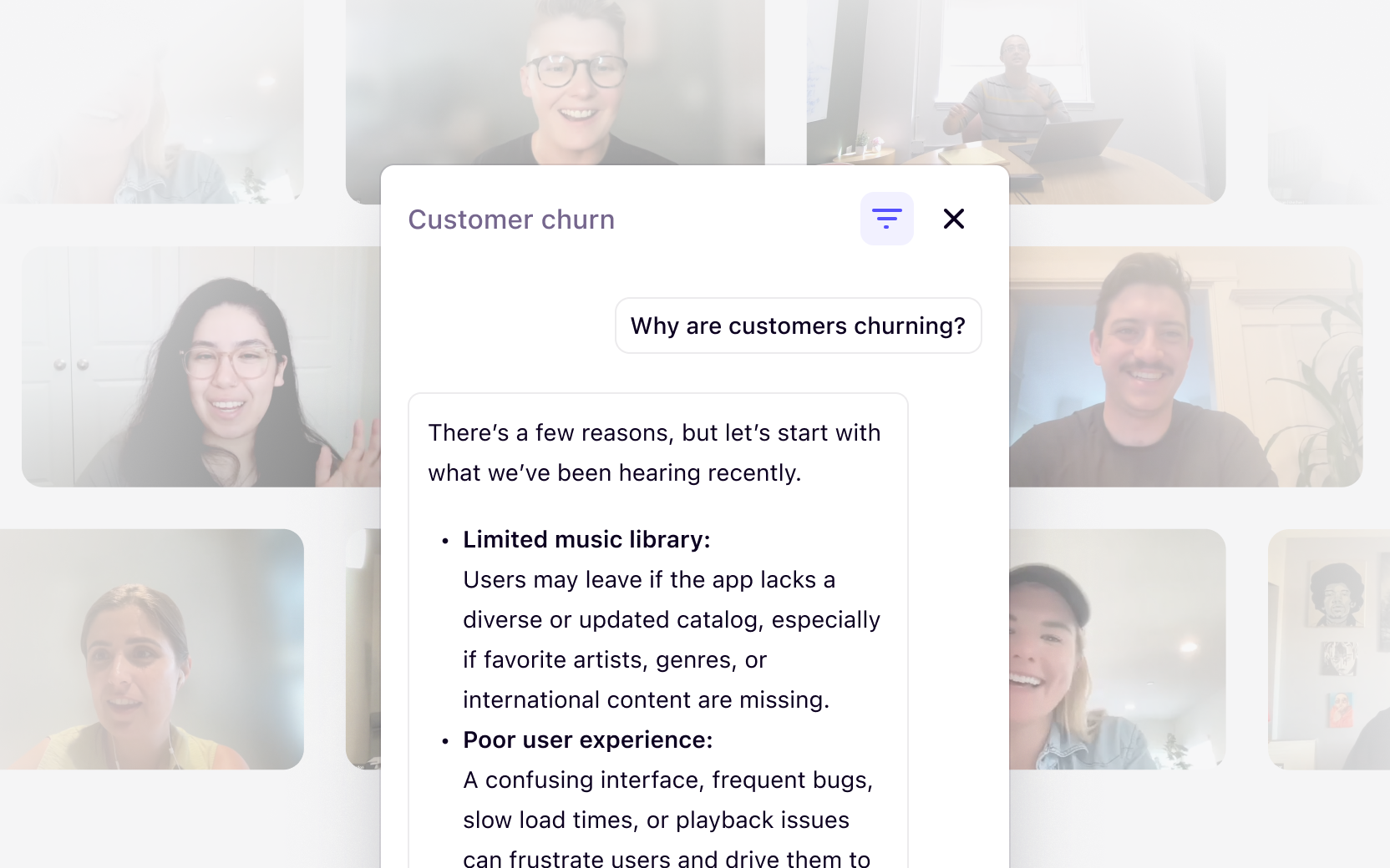
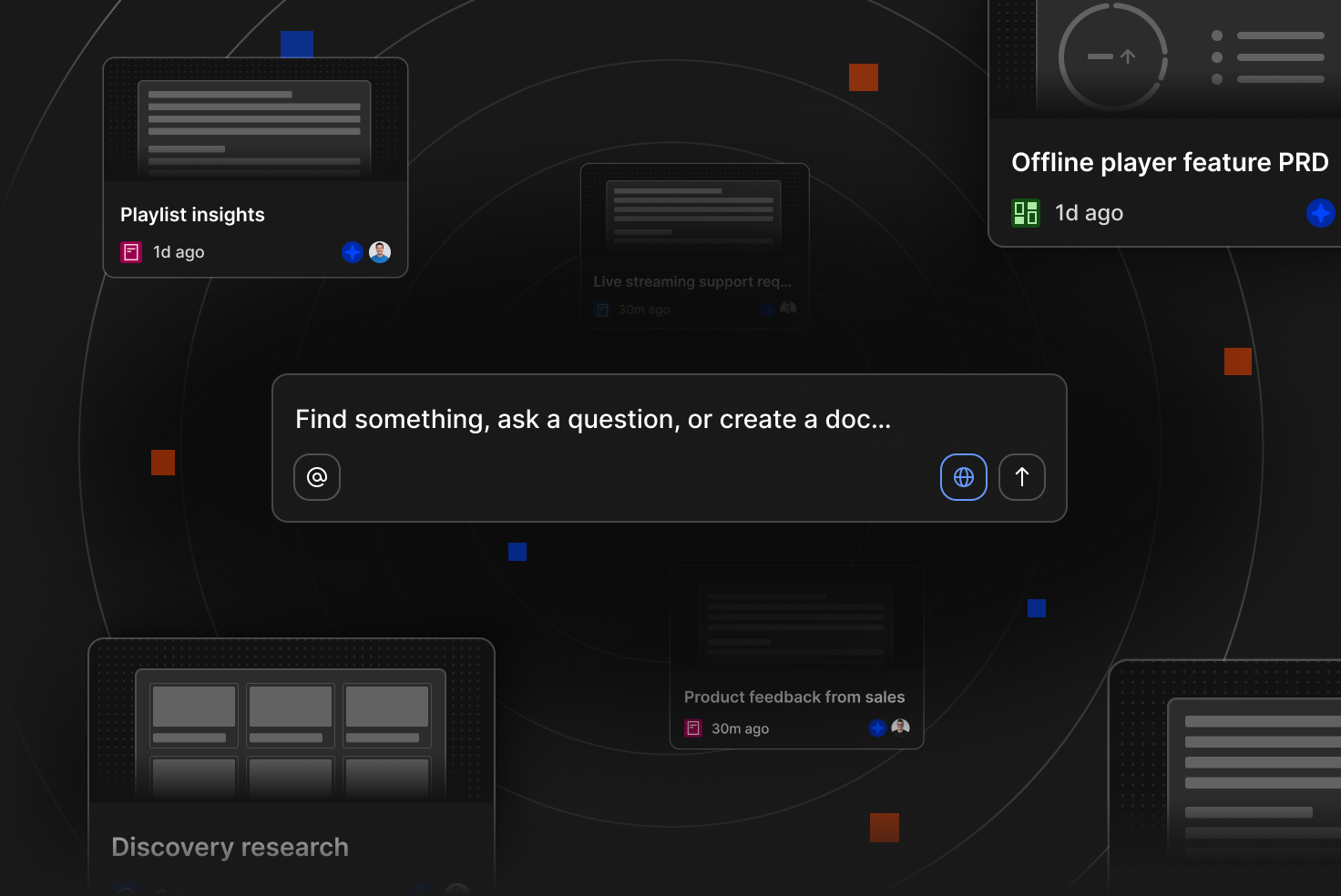
Our new home begins with chat—the fastest way to find insights in Dovetail. Instead of navigating through folders or browsing through multiple pages, your team can simply ask a question in natural language and get an answer instantly, pulling from all data across your workspace. This also matches the experience users have come to expect from other AI tools like ChatGPT, Claude, and Gemini.
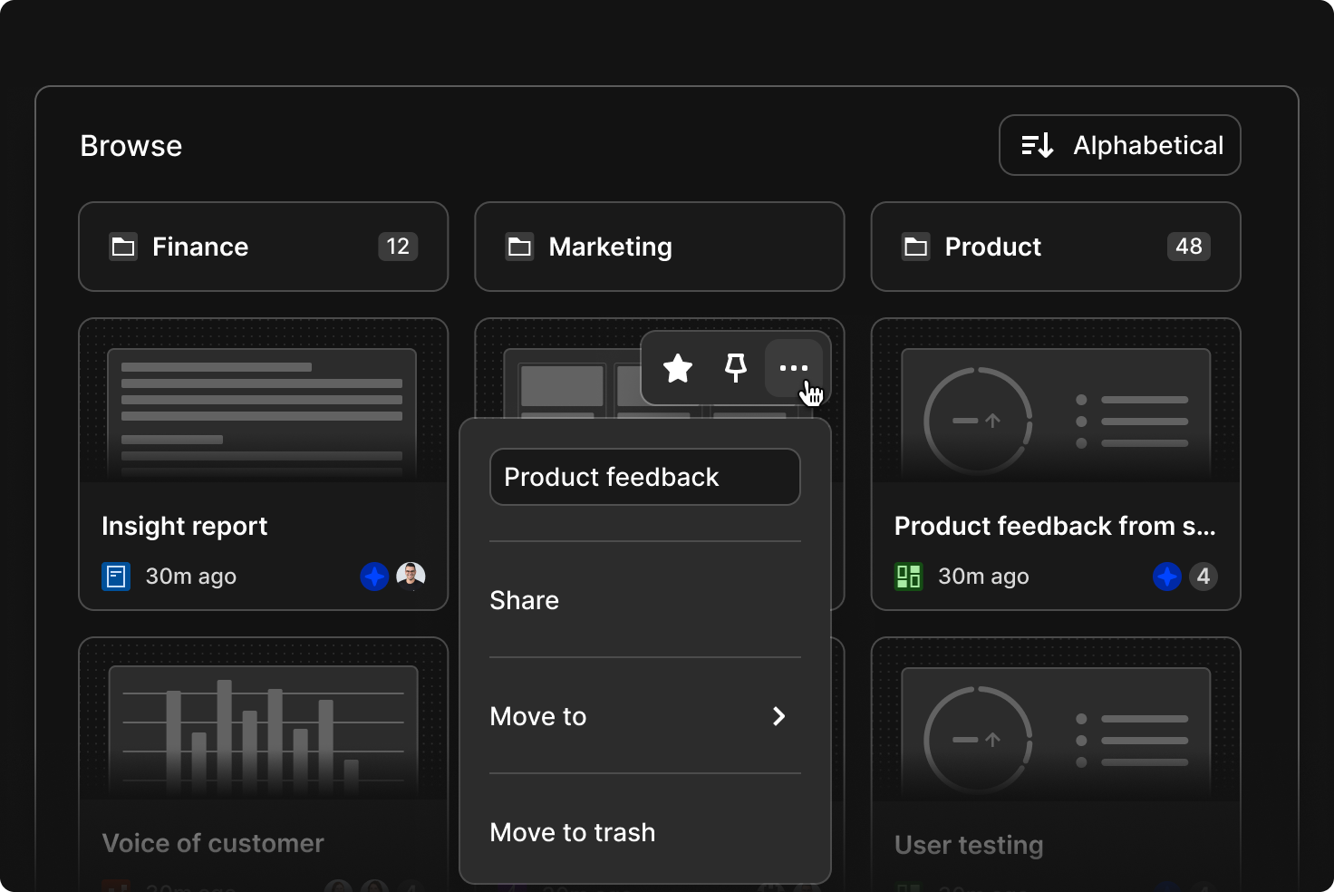
Underneath chat, admins can still pin what they think is the most important information—specific folders, docs, projects, channels, or dashboards they want to prioritize for the team.
If you need to show compliance or legally required information for your team on home, admins can now add an announcement banner. Set it up in Settings under the “Compliance” section. It’ll appear just below chat, so it’s the first thing your team sees.
Our new For you section on home is dynamic and personalized. With no setup required, it automatically surfaces what’s most relevant to each member of your team based on what they’ve been working on and what’s happening across the workspace. This means less manual work for you and a more useful experience for your users.
If your team prefers to browse to find information, all folders are now accessible under Browse, reflecting how your company organizes work, whether that’s by product, project, or function. Users can now also create content in Dovetail without needing to select a folder, reducing friction. Items that are created without a folder (at the workspace ‘root’) will appear under Browse alongside folders. Admins and users will soon be able to organize content with drag and drop—just drag things into folders.
As part of rolling out the new experience, we are retiring two features: custom home and feeds. The average amount of data in a Dovetail workspace is growing rapidly through direct integrations with multiple data sources. These features were designed to help organize data, but require significant manual setup and ongoing maintenance to avoid broken configurations or outdated information.
Adoption of these features has also remained low over time with most users now relying on chat to quickly answer their most important questions. Going forward, teams can receive updates directly in the tools they use every day, with agents automatically delivering the latest customer insights where work is already happening. This makes it easier to keep everyone informed without manual setup.
Learn more about chat and agents
Updated sidebar
We’ve made some improvements to the sidebar, which is available everywhere in Dovetail via the “Menu” button in the top left.
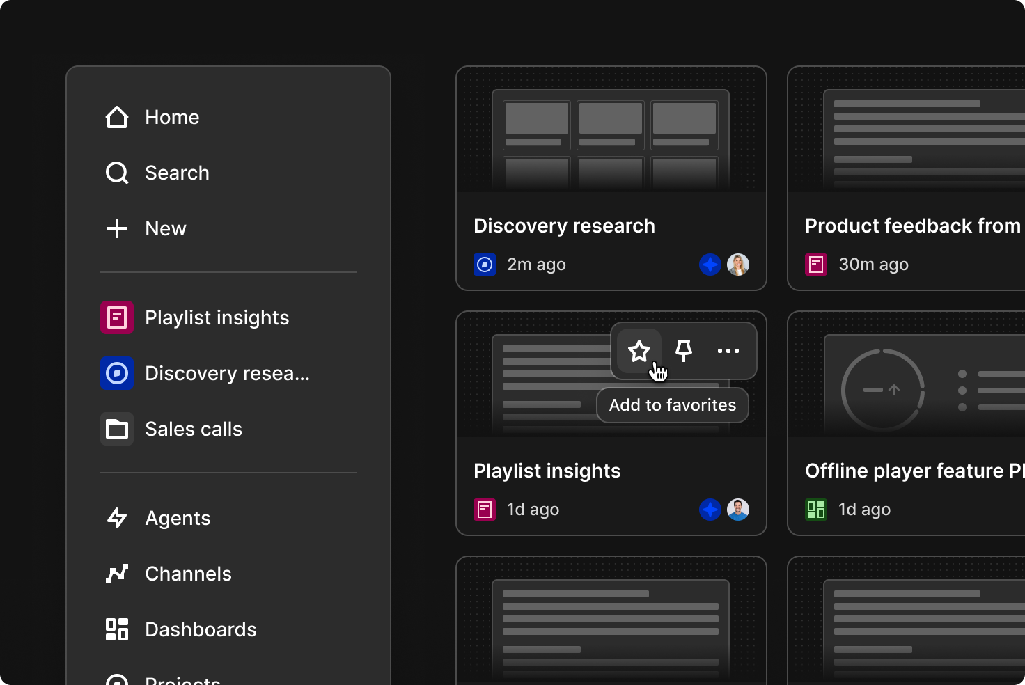
At the top, click Search to find or explore data, or create something by clicking + New. Below that, you’ll find your Favorites. You can favorite folders, projects, docs, channels, dashboards, and agents and they’ll always show up here for easy access. Soon you’ll be able to just drag and drop items directly into your favorites in the sidebar to quickly save what matters most.
Each feature in Dovetail now has its own dedicated page—agents, channels, dashboards, projects, and docs. Each page displays all of that type of object, regardless of what folder it lives in, giving your team another way to quickly find what they’re looking for. You can also skip opening the sidebar entirely and use keyboard shortcuts instead:
- Press c to create
- Press ⌘ + K or Ctrl + K for search
- Press n to open notifications
New folder navigation
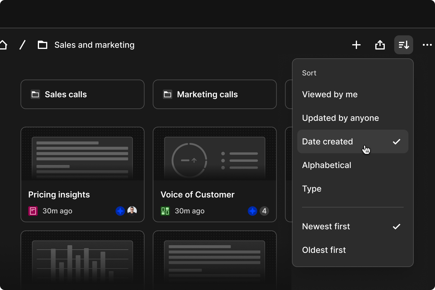
Within folders, you can now quickly sort results by clicking Sort in the top right, so you can choose what to see, whether that’s everything in alphabetical order or only things you created. Across the Browse section and folder pages, folders are always shown at the top and clearly separated from the individual items below, making it easier to scan the content on the page. At the moment, only grid layout is available, but a more compact list view will be available soon.
Search and explore
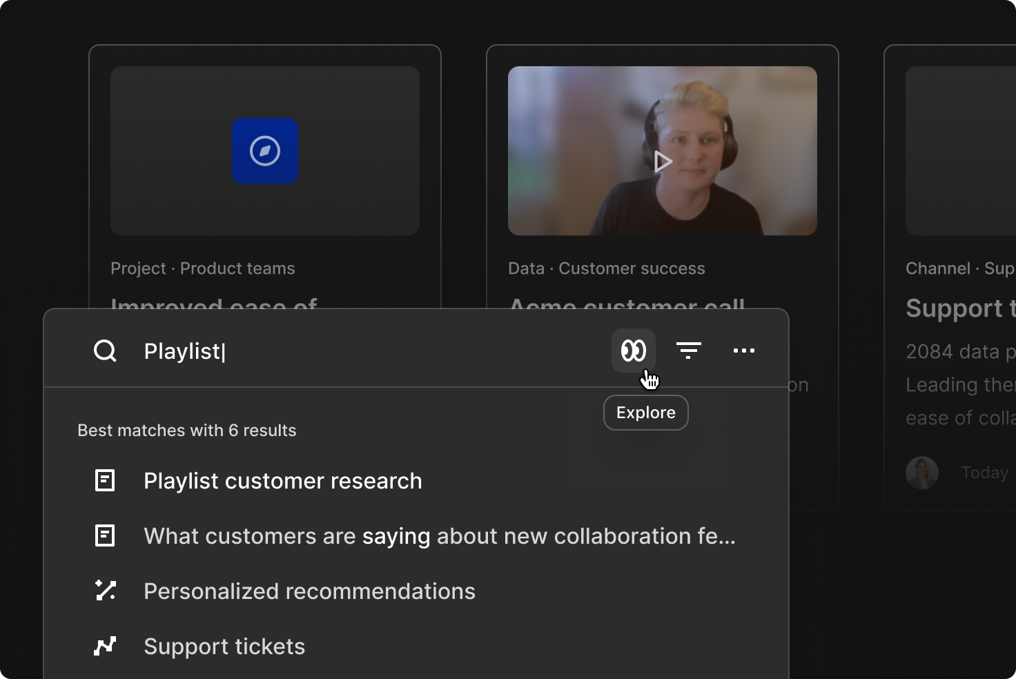
Quick search is faster, smarter, and easier to use. We’ve improved performance, updated ranking and weighting, and streamlined the experience so you can find answers and content more quickly. It also includes new features, such as AI summaries that appear automatically for question-style searches. You can open these summaries in Chat to continue exploring, with your original queries carried over.
Try the new search experience by pressing ⌘ + K or Ctrl + K anywhere in Dovetail.
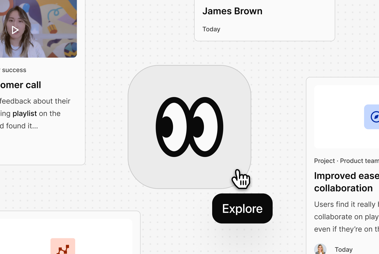
Explore is a new visual experience with a results view optimized for scanning and discovery, designed for moments when your team needs depth and context. It helps your team move through highlights, projects, and key parts of your customer conversations, making it easier to understand emerging patterns and the broader customer story.
For the next couple of weeks, users can try these changes before the full transition on April 30. Users can enable or disable as needed by clicking More at the bottom of the sidebar and toggling it on or off next to “Enable for me”. This gradual transition allows your users to explore the new interface at their own pace while ensuring a smooth handover.
This is just the beginning. We’ll continue improving this experience to make it more personalized for you and your organization. Soon, you’ll see new ways to view the latest customer insights created by your team, a new list layout, the ability to manually reorder pinned items, improved drag-and-drop for bulk selections, and more.
We’d love to hear your feedback. You can message our product team directly by clicking More at the bottom of the sidebar, then selecting Give feedback. We read every comment, so please share your thoughts, they help us make things better.
Related Articles