Evolving our colour system: refining the palette
The Oct 8 launch revealed inconsistencies across light and dark themes, data visuals and tags, caused by dozens of ad hoc hex codes. We’ve moved to a ramped LAB/LCH-based system, creating smooth, balanced colour scales that work consistently across themes. This improves accessibility, ensures contrast, and brings cohesion across all UI elements.
Context
The Oct 8 launch introduced Dovetail’s rebranded colours and accents. During the implementation, we started noticing inconsistencies with how colours were being applied across the product. We noticed light and dark themes not mapping neatly, data visualisation colours were losing vibrancy in dark mode, light mode colours were wanting to be used in dark mode and tag/highlight boards received a wave of feedback for being “ugly” or lacking contrast.
The root cause? We’ve been managing dozens of adhoc hex codes instead of a structured system. Without consistent ramps or rules, maintaining parity between themes becomes increasingly difficult.
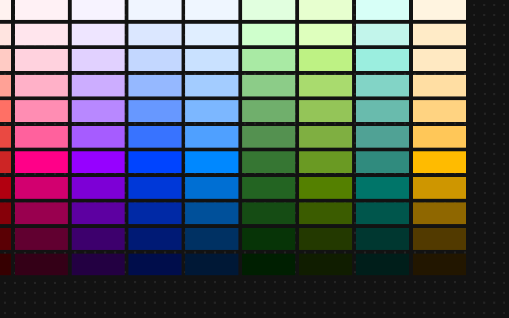
See our existing colour blend implemented on Oct 8 launch:
We also changed our colours between light and dark mode, so “b24” (blue 24) would point at a different hex colour depending on which theme you were in. This caused a extra cross referencing when working with colours.
What’s changed?
As we scale to support both light and dark (and potentially future) themes, we need a system that:
- Works symmetrically across modes (b70 is the same colour regardless of mode)
- Provides flexibility for data vis/states/highlights/backgrounds
- Meets accessibility and contrast requirements
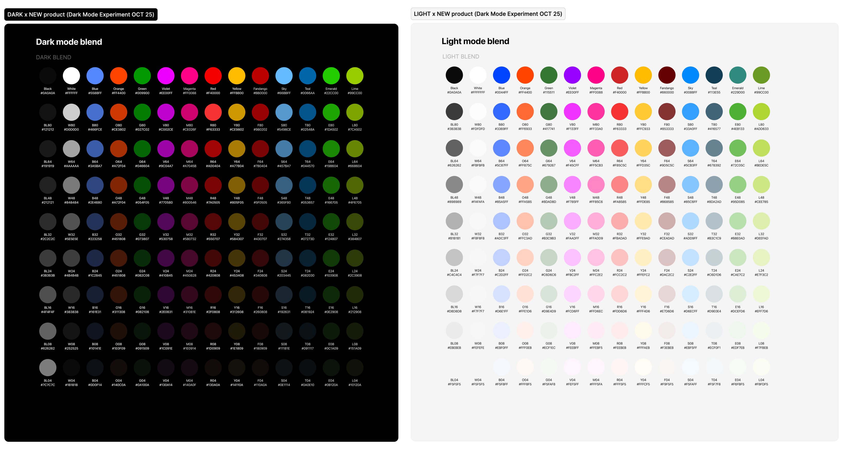
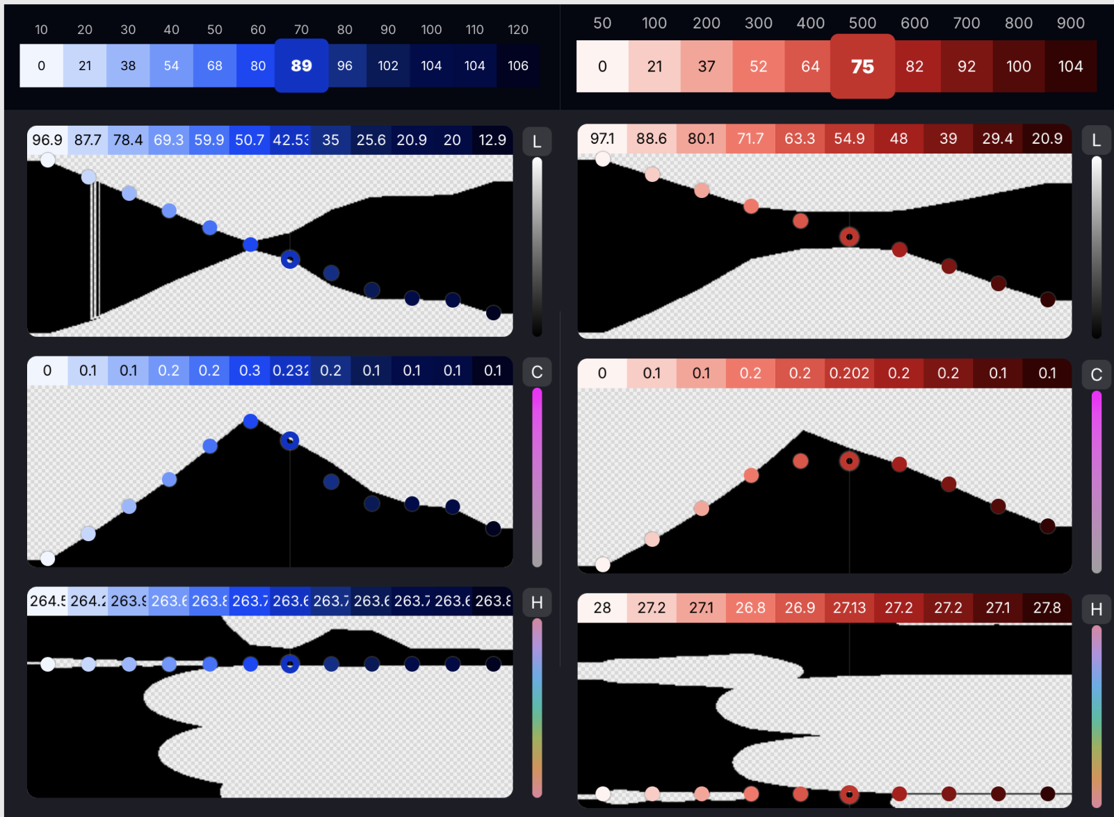
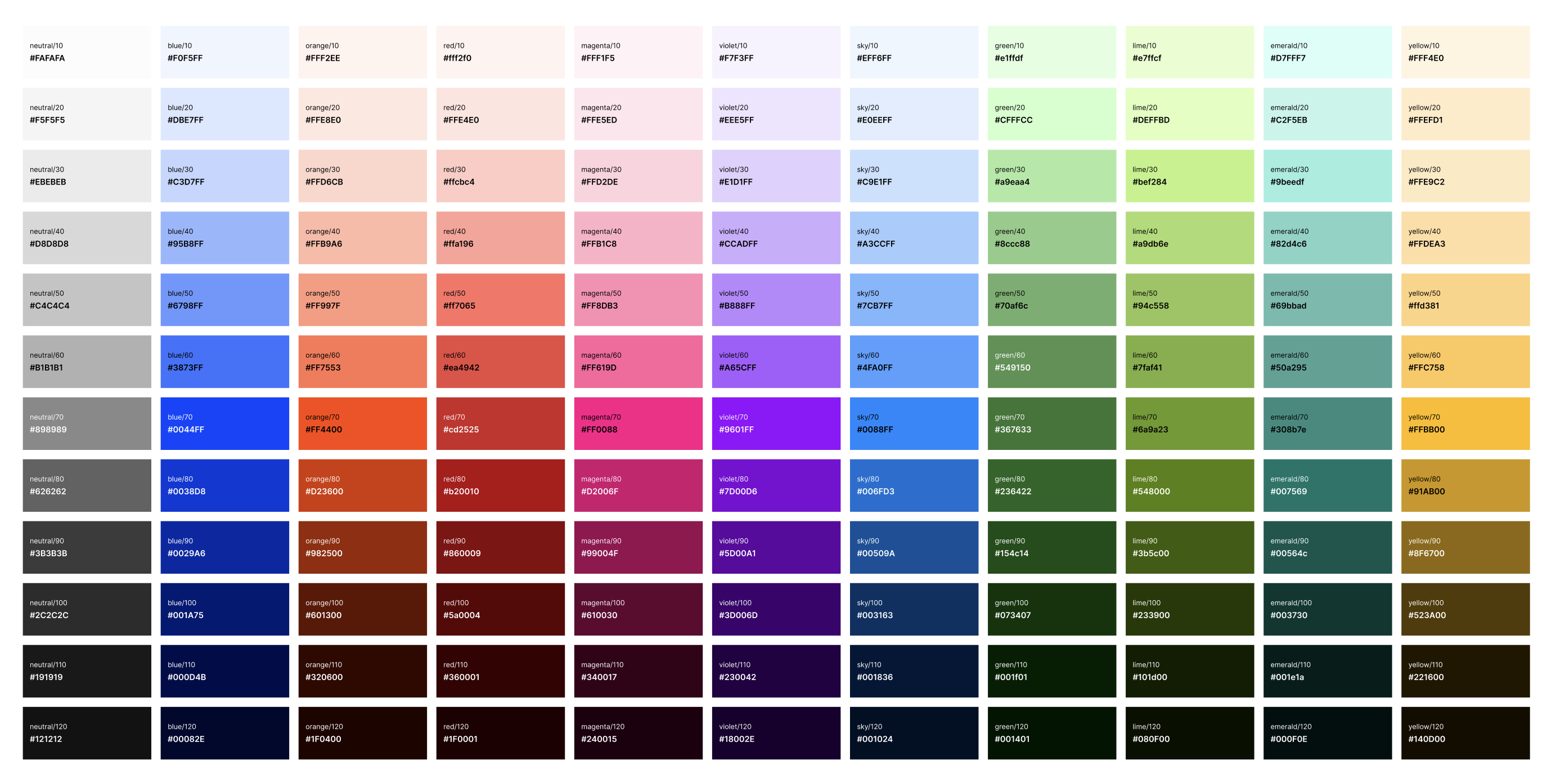
To do so, we’ve moved to a ramped colour system, inspired by Atlassian’s application. Each colour family (blue, orange, emerald etc) now scales smoothly from light to dark. We used the LAB/LCH colour space to generate our colour sets. This technique takes into account the luminosity from a human perspective rather than just matching numbers for saturation/lightness. Colours like yellow/teal need to be handled much differently to reds/blues. Instead of duplicating hex codes for both themes, we define colours in HSL (hue, saturation, lightness). This approach gave us flexibility and allowed us to simplify our palette (resulting in the removal of fandango & teal from our suite).
HSL lets us systematically generate lighter and darker versions of the same hue and vibrancy while maintaining consistent saturation. This means our ramps are perceptually even and every colour step/band can be mirrored across light and dark themes with minimal tweaking.
Pairing colours from opposite sides of the spectrum meet WCAG AA & AAA contrast ratio requirements:
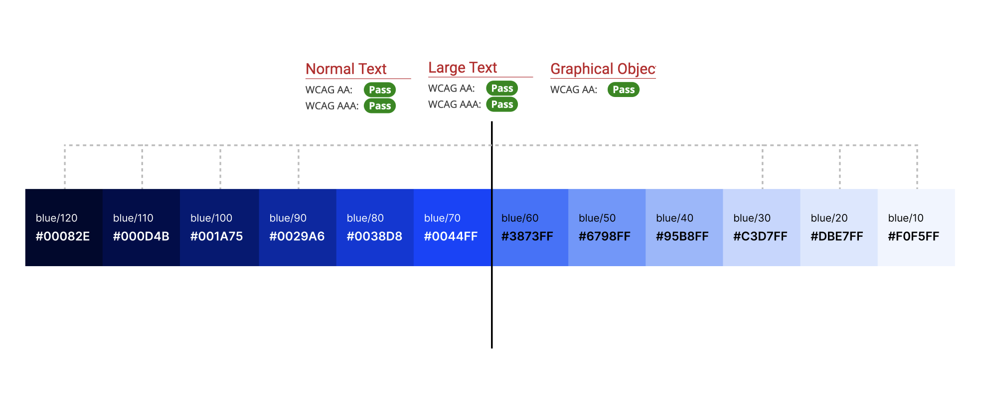
Each colour ramps consistently (10, 20, 30...120), ensuring balanced vibrancy and a cohesive overall palette. Going up by 10s allows us the flexibility of adding steps in between if needed in future.
Ideally choosing a set of colours across a horizontal row should all be of similar luminosity, resulting in a more harmonious set to our eyes.
Why this matters
Symmetrical light & dark themes
- Each colour ramp contains both light and dark variants, so we can use the same system across both modes (no more separate colours)
Better accessibility
- Predictable lightness values make it easy to maintain WCAG contrast
Consistency everywhere
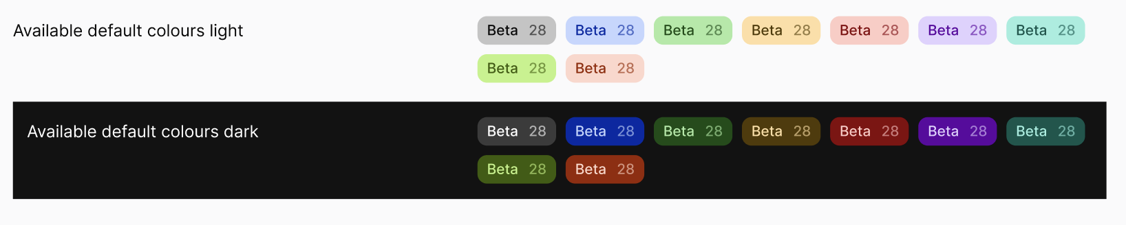
- Tags, highlights, charts and UI elements will all use the same balanced ramps, avoiding one off hex codes
Scalability
- Updating themes and colour introduction will be an easier integration and adaptable, making it more consistent
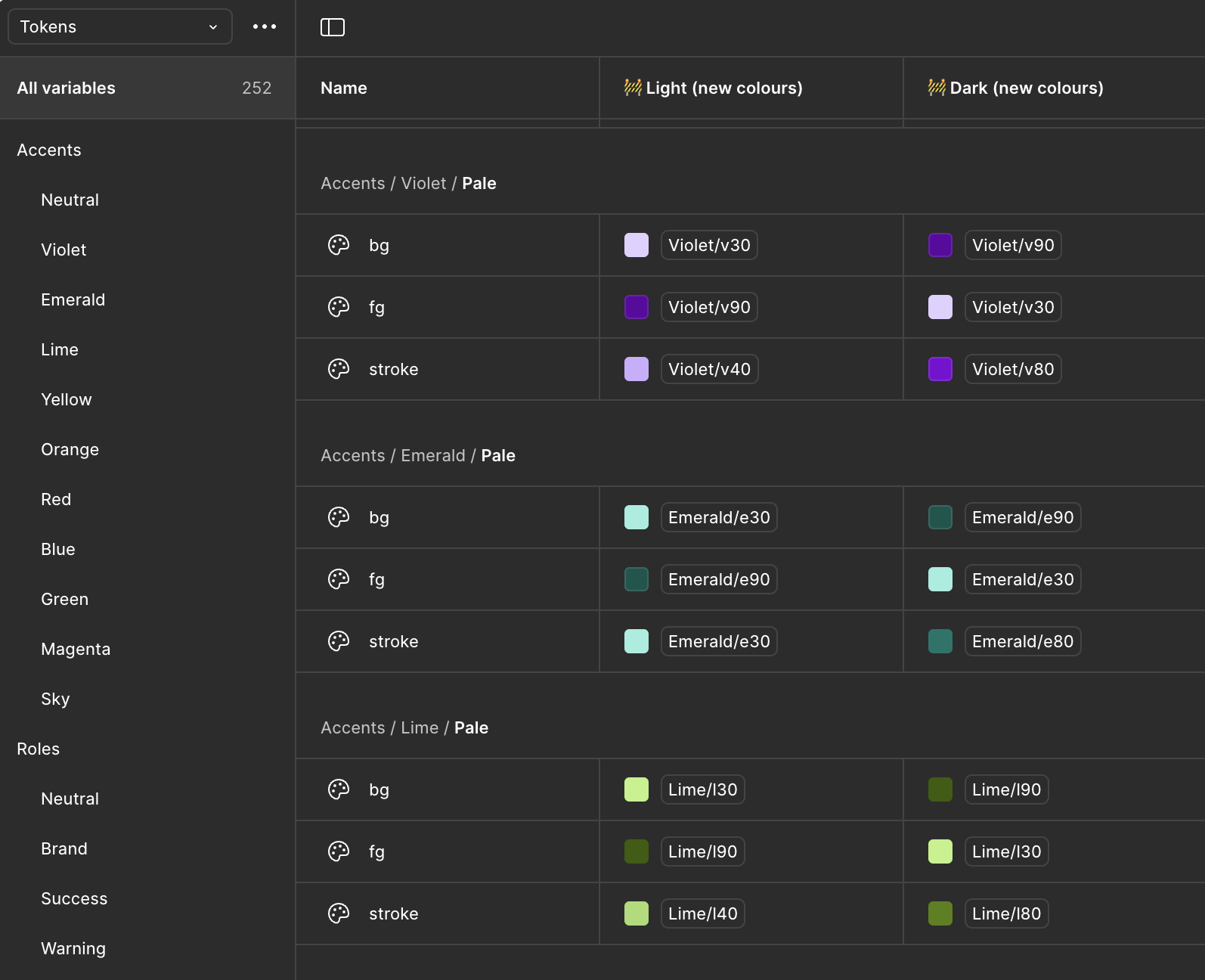
Using the new system (designers)
- Default brand colours now sit in band 70 - use this as your baseline

- Black and white now live in the neutral ramp, removing previous confusion between codes (eg black vs blue: bl32 vs b32)

- Each colour has paired foreground (fg) and background (bg) variants for pale/default/bold accents, all passing contrast requirements.
- Colour selection should be based (approximately) on bands for consistent luminosity, saturation and vibrancy
Related Articles