Teardown of modern car design: What happens when usability is no longer a priority

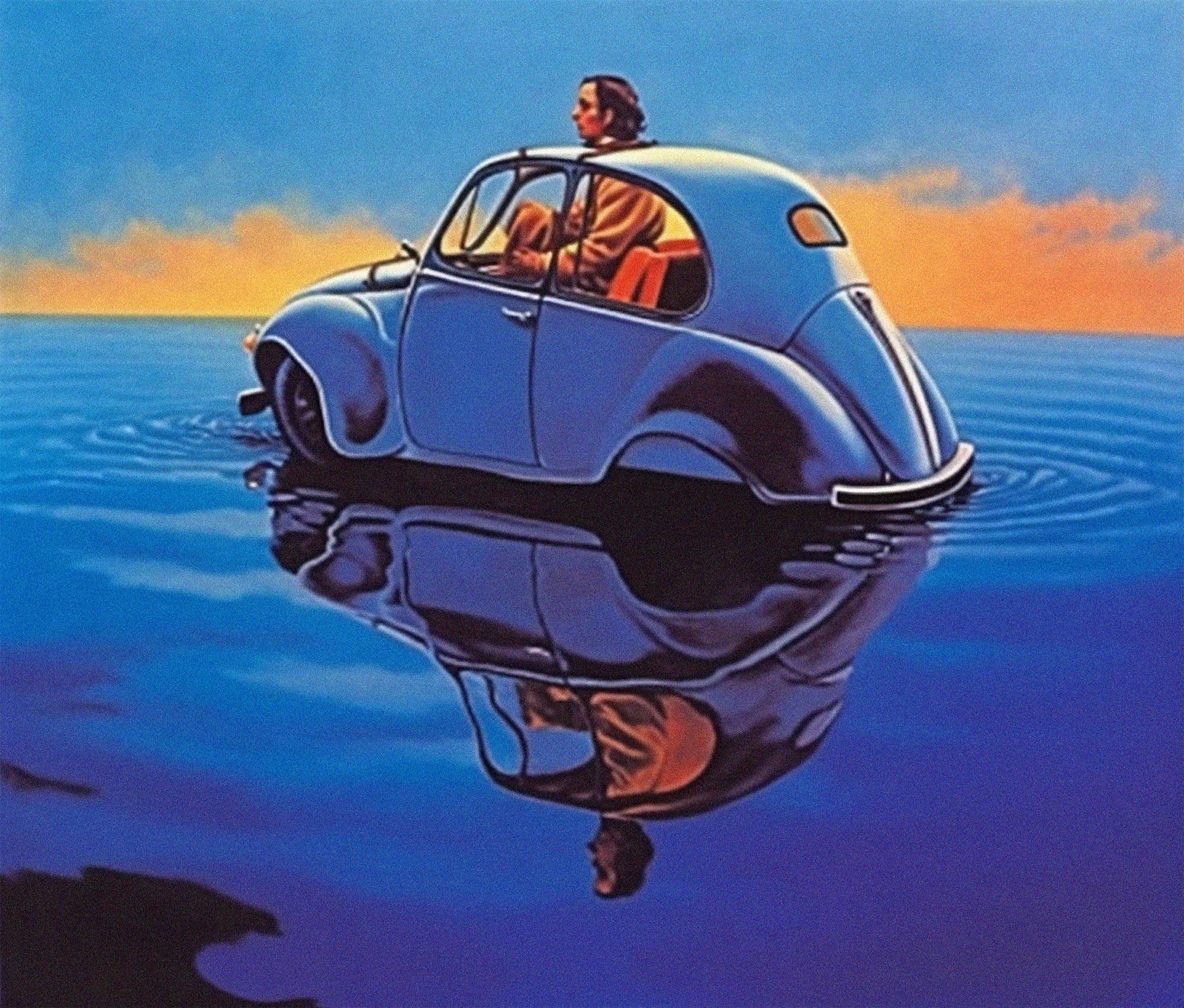
Water water everywhere, and I can’t fit in my seat.
For their high-tech instruments and interfaces, the modern car is bafflingly unusable, Design Lecturer and CEO of Rival Hamish Henderson writes.
I was in my car late last year when I decided to pop into a local sushi restaurant. I indicated, slowed, stopped, and prepared to reverse parallel park. Textbook maneuver. Unfortunately, the driver of the car behind obviously hadn’t read the same textbook and promptly drove into the back of me.
After extracting myself from my car and receiving a stream of apologies and explanations from the driver, I suggested that they park on the side of the road, and we exchange details. They agreed and, continuing to struggle with the safe operation of a car, promptly reversed into the car behind them. Two-nil.
All-in-all, it was a pretty shabby display of driving, and I never got my sushi.
After my car had been towed away, I realized I would be without personal transport for several months. Thankfully, my insurance company had provided me with a rental (or four different rental cars as it would transpire).
In the subsequent months, I was treated to a smorgasbord of late-model cars that left me asking a number of questions ranging from the economics of insurance companies to the professional abilities of smash repairers.
One question in particular, however, remained: why has the role of human factors taken a back seat in the design process of modern motorcars?
Human factors as an engineering and design specialty has been around for decades. Broadly speaking, human factors is the application of psychological and physiological principles from various fields to the design of products and systems. An important part of human-factors engineering is designing for usability.
Naturally, usability is hugely important in the design process, including everything from consumer electronics to the cockpit of an aircraft. Simply put, things that aren’t particularly usable usually aren’t very useful. For many, the consequences of poor usability amount to little more than frustration. In the case of a motorcar, usability issues could lead to serious injury or even death.
When I climbed into my rental vehicle—a late model Mercedes C-Class—I was struck by how many historically analog interfaces (speedometer, air-conditioning controls, etc.)the manufacturers had replaced with digital equivalents and touch screens.
I tried to understand the reasoning behind migrating to these types of interfaces. Perhaps the bean counters had determined that screens were cheaper and more reliable than physical buttons, knobs, and levers? Or perhaps the marketing and product teams concluded that motorists would perceive a touch screen as modern and superior to their analog ancestors.
While there is no doubt that the end product looks impressive and “hi-tech”—the result is far from usable. Tasks that used to be simple have now become unnecessarily burdensome.
Take the climate controls as an example. When I got my license, I purchased a Ford Falcon, a trusty steed that, on a good day, ran on five of its six cylinders. The Falcon had a straightforward climate control panel consisting of sliders and buttons. This interface had the added benefit of allowing the driver to manipulate the controls fairly accurately without taking their eyes off the road. Each slider had a prominent knob, which allowed the driver to feel its location and deduce which function it controlled based on its relationship and proximity to the other sliders on the panel. Because these sliders were constrained in their track, the driver would receive instant physical feedback that they’d reached that function’s minimum or maximum range without looking.
Contrast this to the large touch screen in the Mercedes. Every inch of the screen feels the same; nothing differentiates the feeling of one part of the screen from another. Accurate screen use requires users to look at what they are doing—not just feel. Every time I wanted to adjust the climate controls, I had to look away from the road and down to the screen, dramatically increasing the risk profile of the task.

An Australian icon in all its glory—the Ford Falcon.
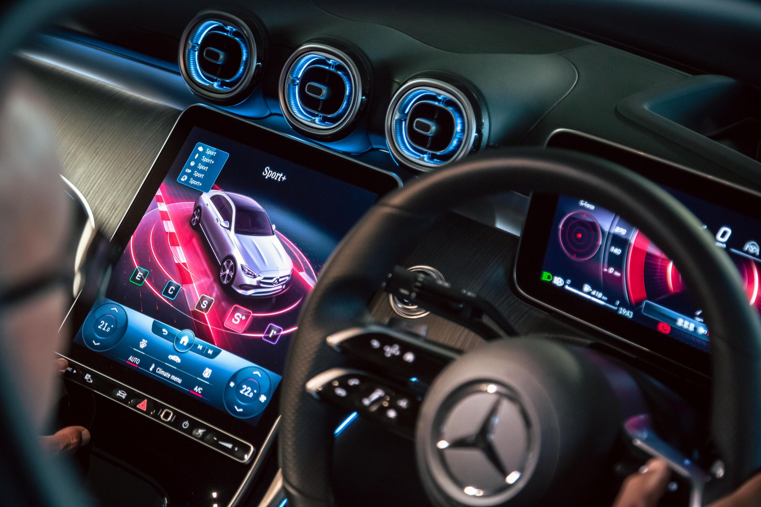
Oh lord, won’t you buy me, a Mercedes I can use.
How controls feel has been a big part of control interface design for decades. The subtle differences in the shapes and textures of input mechanisms allow operators to utilize senses other than sight to interact with the correct input. This reduces the cognitive load for the operator and maximizes the safety envelope.
The positioning and shapes of input mechanisms are important design decisions with safety implications. That’s why the brake pedal in automatic cars is big, and the accelerator is thin and narrow. Unintentionally braking tends to be less problematic than accelerating.
Nevertheless, mistakes occur, and drivers unintentionally push the wrong button or lever. When getting into an unfamiliar car, it’s not uncommon to activate the windscreen wipers when you mean to use the turn indicator.
I was very surprised that Mercedes had moved the gear selector from the console between the seats to the same location as a turn indicator. On multiple occasions, I reached for what I thought was the indicator only to put the car in neutral. Am I at fault here, or is it bad design? Probably both.
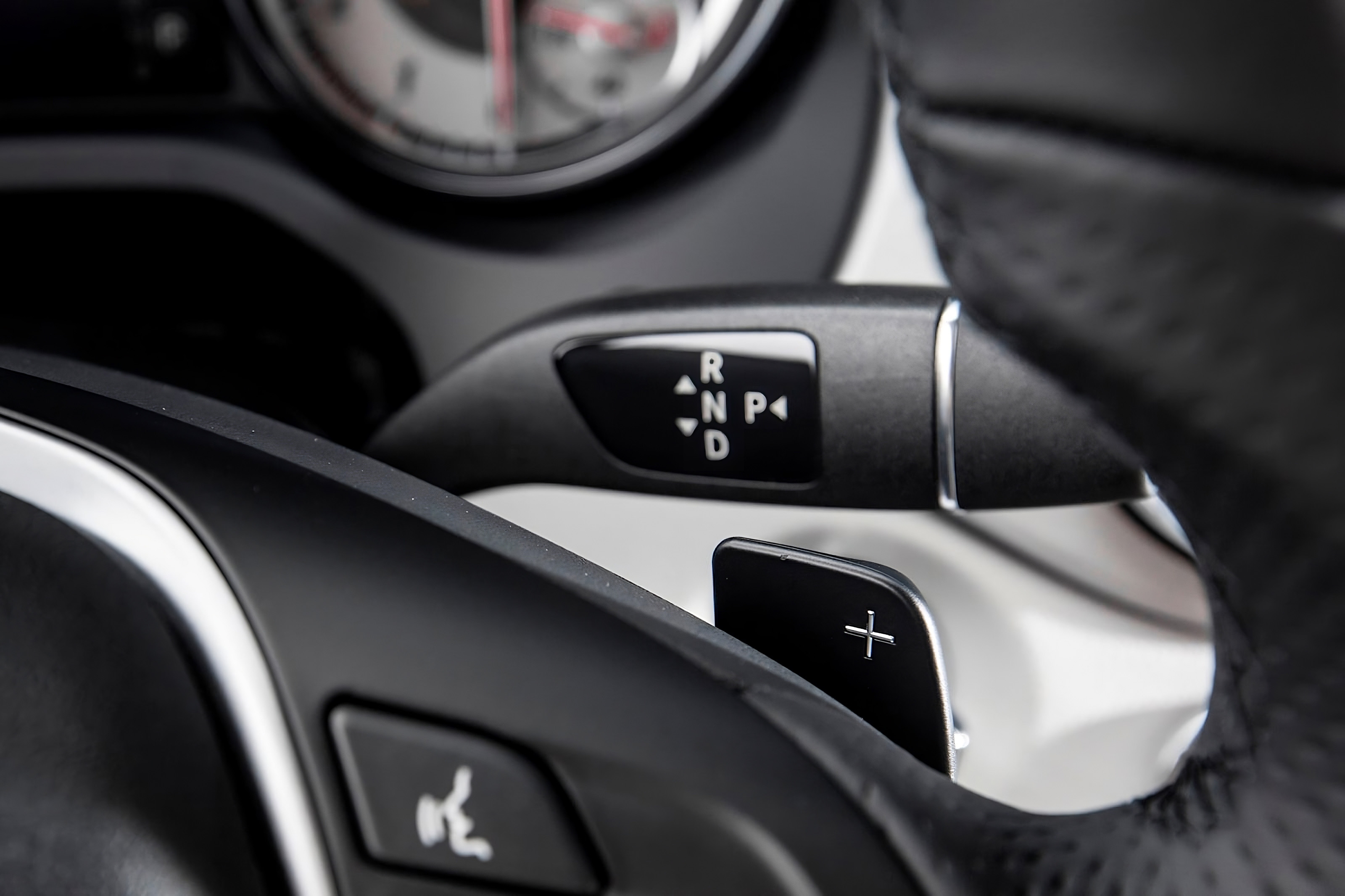
“Full of surprises”—not a review car manufacturers should be looking for.
Touch screens and gear selectors were not the limits of bizarre design decisions in modern cars. I was shocked to see how basic and somewhat timeless components such as door handles had been redesigned without any thought given to their usability.
Take the Tesla’s door handle. It sits flush with the car’s body and pivots to reveal a “grabable” handle when you push one-half of the handle. This unintuitive design is quickly defended by the Tesla faithful, who, after proudly justifying their purchase of what is essentially a golf cart with doors, will quickly tell you that these design decisions conclusively result in better outcomes.
I have heard a few justifications for the door handles ranging from minimalism to aerodynamic benefits—the latter naturally being relevant in a suburban context while doing the school run.
Recently, I went to get into a friend’s Tesla, and almost instinctively, they started explaining how to use the door handle. While I might not look particularly intelligent, I have never previously required instruction on how to open a car door. Yet, on this occasion, I actually did need help—I couldn’t deduce how the handle worked by looking at it.

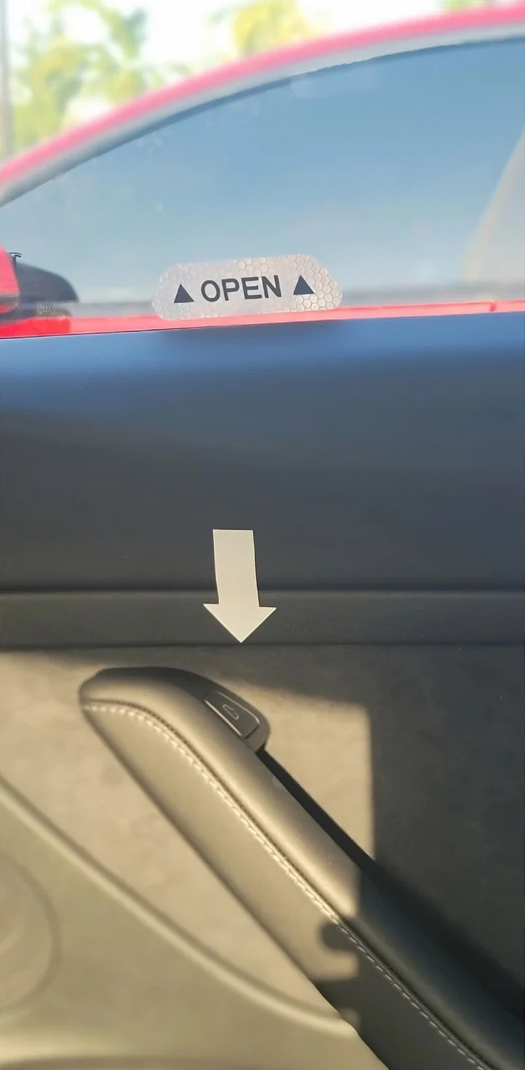

It turned out that I need not be embarrassed as other Tesla passengers also shared my difficulty in opening the doors. Indeed, some owners had gone to some lengths to avoid repeatedly telling their passengers how the door handles work.
One morning, I pulled up beside a Tesla whose owner had placed large stickers around each door handle to explain how to open the door. These stickers, while no doubt maintaining the aerodynamic efficiencies pursued by Tesla drivers, did compromise the visual minimalism that the door handles might’ve achieved. Back to square one, it would seem.
The door handles were hard to use because they lacked intrinsic information about how they worked. Donald Norman, a pioneer in User Experience, would probably say that these door handles lack affordance.
In his seminal text “The Psychology of Everyday Things” (1988), Norman states “...the term affordance refers to the perceived and actual properties of the thing, primarily those fundamental properties that determine just how the thing could possibly be used. [...] Affordances provide strong clues to the operations of things. Plates are for pushing. Knobs are for turning. Slots are for inserting things into. Balls are for throwing or bouncing. When affordances are taken advantage of, the user knows what to do just by looking: no picture, label, or instruction needed.”.
Design principles like affordance that Norman expands on in his work have been around for decades, and many have been utilized by industrial designers long before he wrote about them. So why have they been so readily dispensed with in recent years, particularly by car manufacturers?
I’m starting to think that some designers are just being lazy. A failure to test is undoubtedly a part of the problem, but I don’t think it’s just that. I believe there is a lack of education and awareness. Sticking a screen on something or pursuing aesthetics without regard to function and usability is short-sighted. At best, these decisions leave you in neutral at a roundabout. At worst, they can kill you.
Innovation will continue to challenge the design of everyday things, and that is a good thing. With new technology will come new interaction paradigms and modalities. Interface and product designers should embrace these challenges. Importantly, we must not see innovation and usability as a dichotomy. The research field of human factors has provided us with a wealth of resources to help work with emerging technologies to ensure they are both usable, useful, and safe.
Designers failing to leverage this knowledge are simply negligent.
Subscribe to Outlier
Juicy, inspiring content for product-obsessed people. Brought to you by Dovetail.